When I started looking around with paint colors in my home, I was confused about crimson and burgundy because they both looked the same.
But after painting my dining room what I thought was burgundy but it was not.
Crimson vs burgundy is not the same. These two have different personalities.
Here’s the thing about crimson and burgundy is that they share the same red base, but the mood they create and the way they make a room feel is different.
Crimson demands attention and burgundy is quiet and makes everything feel expensive.
So, I’m breaking down what makes Crimson Vs Burgundy, their undertones, how they look in rooms, and which one you should pick according to what you’re trying to do.
I’ll also put in some other red comparisons.
Here are my other blogs that you can also read:
- Sherwin Williams Vs Evergreen Fog
- Tricorn Black Vs Iron Ore
- Egret White Vs Alabaster
- Soft Chamois Vs Swiss Coffee
- Classic Gray Vs Pale Oak
What is Crimson?
Crimson is the bold, vivid red that has a hint of cool blue or purple. When I painted a test swatch in my hallway, my daughter said it looked fancy and she wasn’t wrong, it’s closer to pure red with drama.
What makes crimson different is how saturated and bright it is. But with the lighting, it doesn’t absorb like dark reds, but it bounces back.
That’s why crimson needs good lighting to perform. I tried using it in my basement bathroom and it looked flat.
In fashion, crimson has the power that moves. It’s the dress you wear when you want to be remembered, sounds dramatic but it WORKS.
For interiors, you’ve to be careful. Crimson looks shy. If you paint your walls, you’ll feel like you’re living inside a full red room.
I learned this when I got confident with Benjamin Moore Crimson 1299 in my bedroom.
Best use for crimson is for accent walls in well-lit spaces, statement furniture pieces, or anywhere you want people to stop and look.
What is Burgundy?
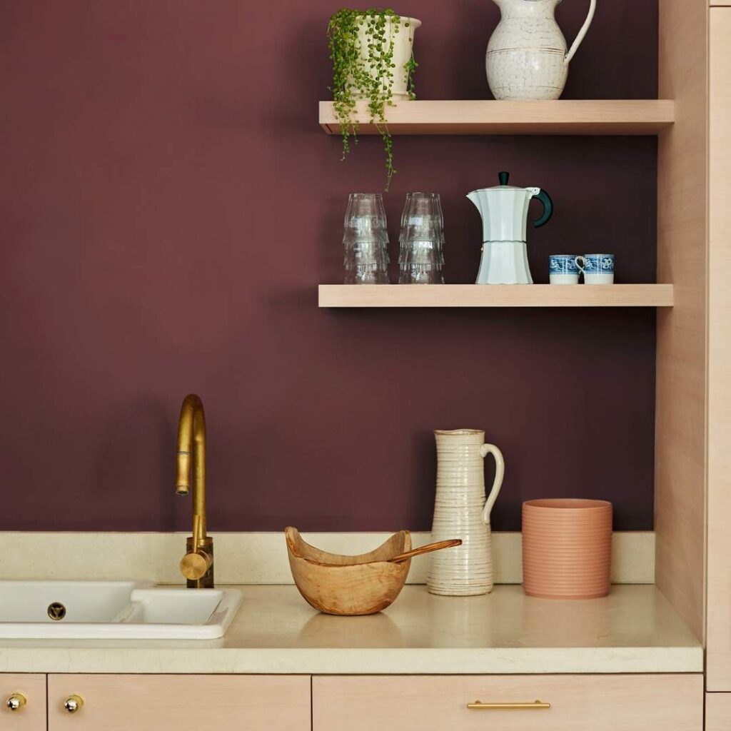
Burgundy is a deep red with strong purple and brown undertones, dark and richer than crimson.
The name comes from the Burgundy region in France, famous for their wines and when you see burgundy paint, you can see the wine connection.
Burgundy is more muted than crimson. It absorbs light instead of reflecting it, which gives it a velvety quality.
When I used it, I painted my home office in burgundy and the difference in how I felt in that space at night and day felt grounded, calm but interesting.
The purple and brown undertones in burgundy make it easy to pair with other colors, where crimson shines, burgundy will pair with it nicely. It works with golds, creams, and sage greens.
In fashion, burgundy is the fall and winter color that makes you look pulled together.
I have burgundy boots, a burgundy scarf, and they work with everything in my closet.
The wine-inspired quality of burgundy means it brings an elegance and you don’t have to work as hard to make it look intentional.
For rooms, burgundy works in spaces where you want depth and warmth like dining rooms, bedrooms, studies or in any type of space.
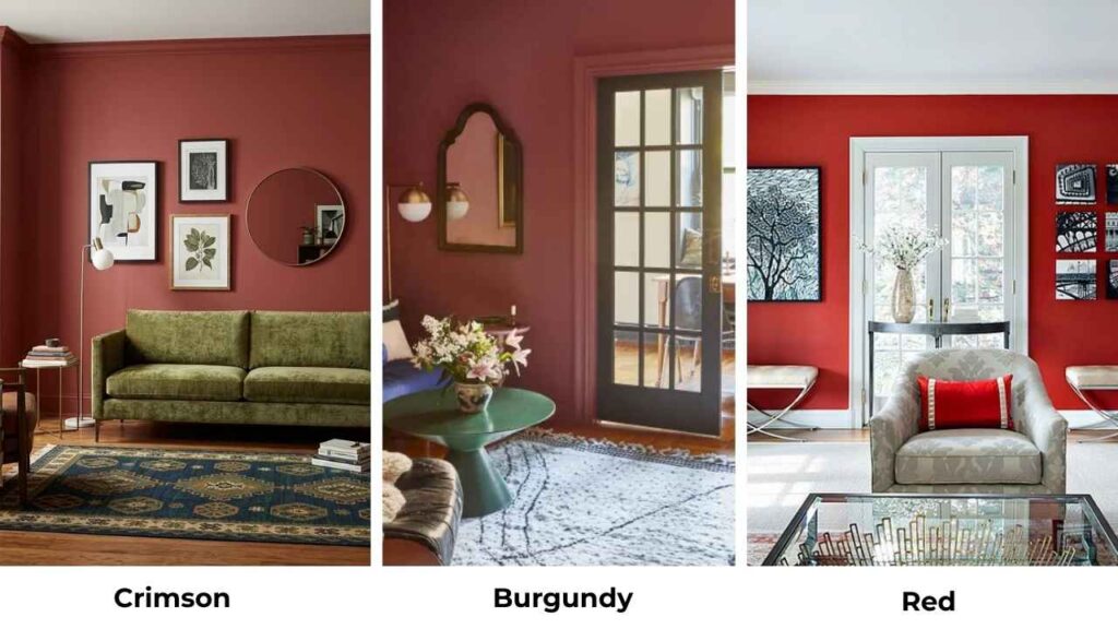
Crimson Vs Burgundy: Key Differences
So here’s where I started understanding Crimson Vs Burgundy. It’s not about one is light or like that but the differences are visible and they matter.
Understanding these differences matters and everyone should consider them and you too.
Undertones
Crimson is basically blue, the cool undertone which gives it the vibrant, electric quality. When you put it next to something warm, you can see the blue influence.
Burgundy leans purple and brown. This is what makes it feel warm and more grounded.
The purple adds sophistication, the brown adds earthiness and together they create something that looks less aggressive.
I tested this by putting swatches next to my tan couch. The crimson looked sharp and modern and the burgundy looked like it should be there.
Brightness and Saturation
Crimson is BRIGHT, high saturation means the color is intense and pure and it reflects more light back, so in a sunny room, crimson glows.
The LRV on Benjamin Moore Crimson 1299 is around 19.58, which is high for a red.
Burgundy is dark and subdued. Dark Burgundy 2075-10 has an LRV of about 5.52, which means it absorbs most of the light moving around.
In practical terms, burgundy makes spaces feel small and cozy, crimson makes them feel energized and open.
Visual Appearance
Crimson needs attention. When someone walks into a room with crimson, they see it first.
It’s bold, dramatic, eye-catching. Some people call it intense or aggressive if you use it too much.
Burgundy looks luxurious, it has that understated elegance thing. The room feels expensive, curated and it’s rich without being loud.
Style and Best Uses
Crimson works best for:
- accent walls in living rooms or entryways
- modern or contemporary spaces
- anywhere you want energy and passion
- statement furniture that needs to pop
- spaces with natural light
Burgundy works best for:
- bedrooms and dining rooms
- traditional or transitional spaces
- creating warmth and intimacy
- pairing with neutrals and metallics
- rooms with medium to low lighting
| Feature | Crimson | Burgundy |
| Undertone | Cool blue/purple | Warm purple/brown |
| Brightness | High | Low to medium |
| Saturation | Very high | Medium |
| LRV Range | 15-20 | 5-8 |
| Visual Impact | Bold, dramatic, commanding | Sophisticated, elegant, rich |
| Best Lighting | Bright natural light | Medium to low light |
| Common Uses | Accent walls, modern spaces | Bedrooms, dining rooms, traditional spaces |
| Pairs Well With | Neutrals, black, white | Cream, gold, brass, earth tones |
How does Crimson and Burgundy Look in Different Rooms?
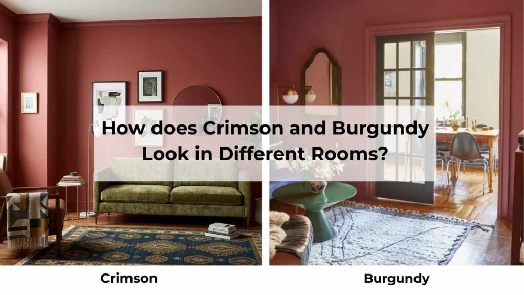
This is where theory meets reality and where I made many mistakes.
So, let me walk you through what I’ve learned from living with these colors in different spaces because some worked beautifully, some maybe not.
Living Room
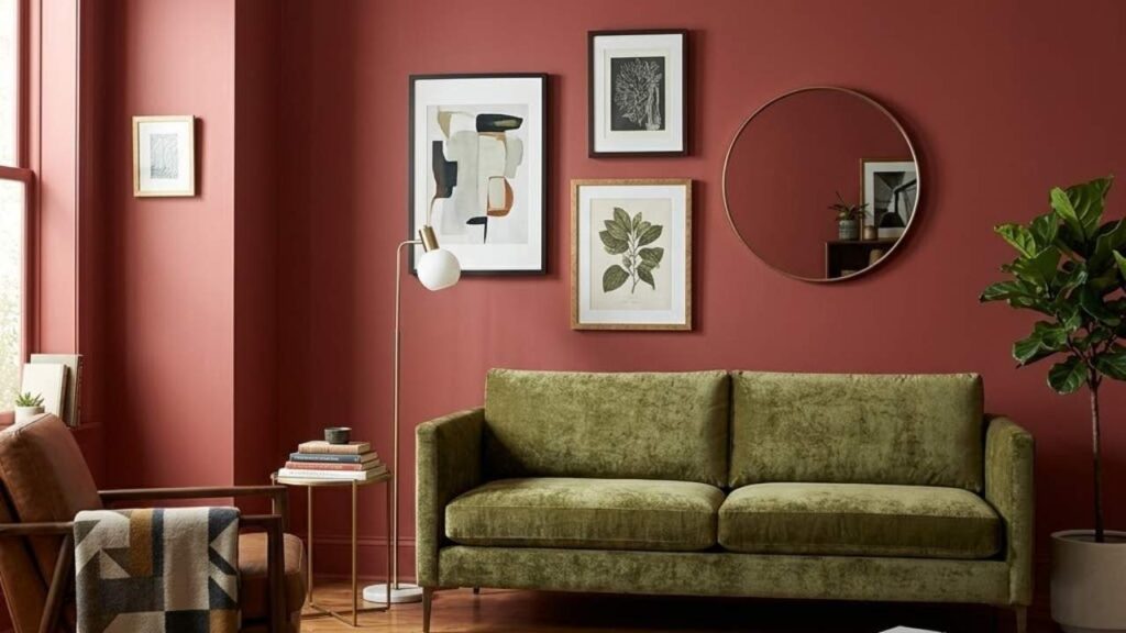
Crimson in the living room is a statement. I painted one accent wall behind my sofa in a crimson shade and it changed the energy.
The room went from a boring beige box to amazing. It made me rearrange my furniture because everything else looked wrong.
The trick with crimson in living spaces is to balance it HARD.
I brought in cream pillows, a gray rug, and kept the other three walls a soft white, without the breathing room, it looked heavy.
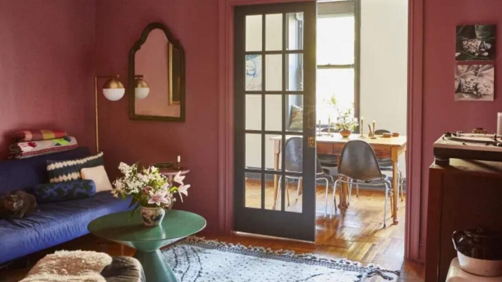
Burgundy in the living room feels different, it’s welcoming but impressive. Burgundy doesn’t need the same level of styling that crimson does.
With this, you can be with your decor and it looks intentional.
Bedroom
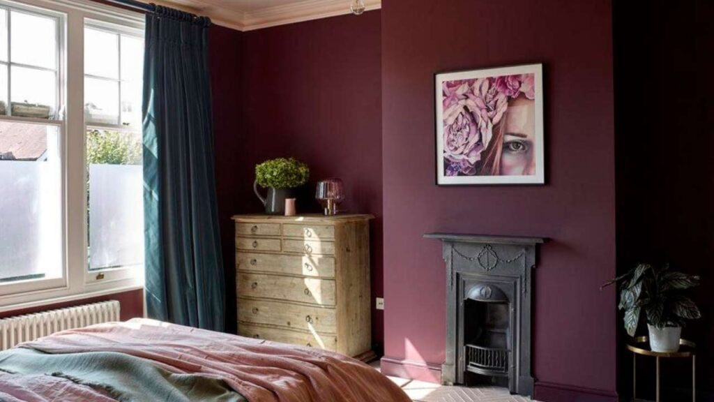
Crimson in a bedroom is tough. I thought it would feel passionate and cozy. Instead it felt like I was trying to sleep inside.
The problem is the crimson is energizing because it’s not a restful color.
I have seen crimson work in bedrooms once. My friend used it on the wall behind her bed, kept everything else white and gray, and it worked.
But she also doesn’t have windows on the wall, so the color isn’t competing with natural light.
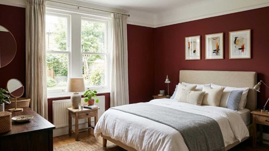
Burgundy in bedrooms is where burgundy shines. After I repainted my bedroom in a burgundy shade, I understood what everyone meant about cozy.
The brown undertones in burgundy make it feel grounded and calm. The purple undertones keep it interesting.
It’s the perfect bedroom color if you want something other than blues and grays.
Bathroom
Crimson in a bathroom can be STUNNING. I used crimson in my powder room and it is small and people are only in there for a few minutes, the intensity doesn’t overwhelm.
It feels fun and memorable. But in my main bathroom, this color doesn’t have to be there. The crimson started feeling aggressive.
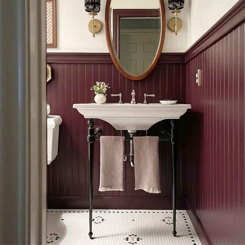
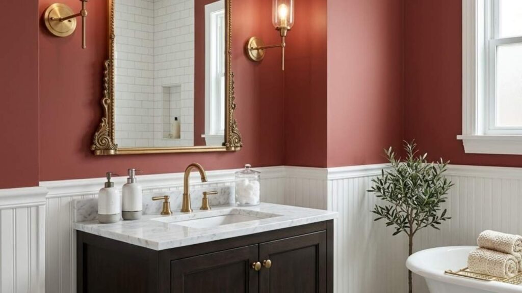
Burgundy in bathrooms works in both small and large spaces. I’ve got burgundy in my master bathroom and it feels spa-like.
The dark shade makes the white fixtures pop and creates a sophisticated contrast.
The key with burgundy in bathrooms is making sure you have good lighting.
I installed warm bulbs because the burgundy was making the space feel cave-like with the cool fluorescent lights.
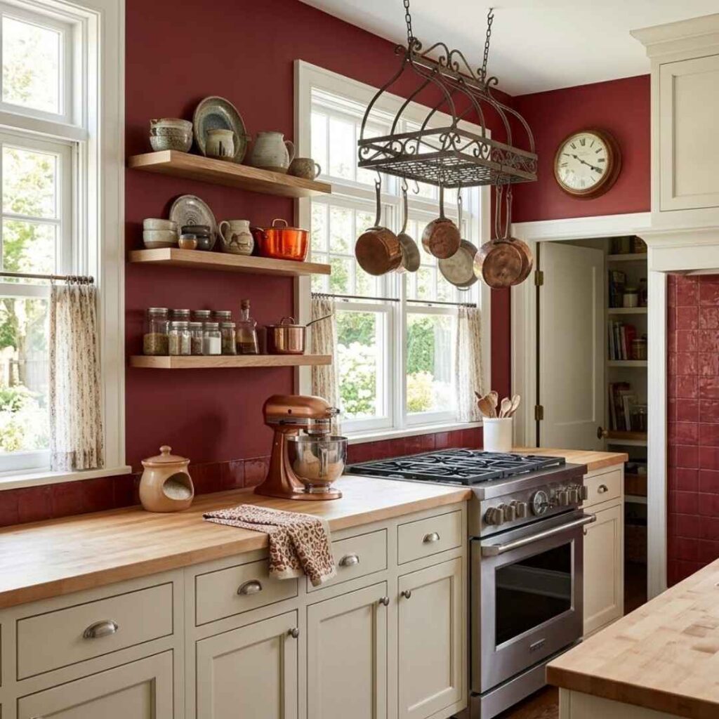
Kitchen
Crimson in kitchens only works if you’re going BOLD with everything.
My neighbor painted her kitchen island in crimson and paired it with black cabinets and marble counters and it was looking dramatic.
If you’re going for farmhouse cozy, don’t go with crimson in the kitchen. Crimson also shows fingerprint and smudge if you’re using it on cabinets.
Burgundy in kitchens feels natural. The wine connection makes it feel appropriate in a space where you’re cooking and entertaining.
I’ve seen burgundy cabinets paired with brass hardware and white countertops that look incredible.
If I were to use either color in my kitchen, it is burgundy on a kitchen island or on lower cabinets. The dark shade hides spots better than crimson’s brightness.
Crimson Vs Burgundy Vs Other Colors
Once you start comparing reds, you realize there are a lot of shades in here.
Let me break down how crimson and burgundy look against other shades because this is where I started making better color decisions.
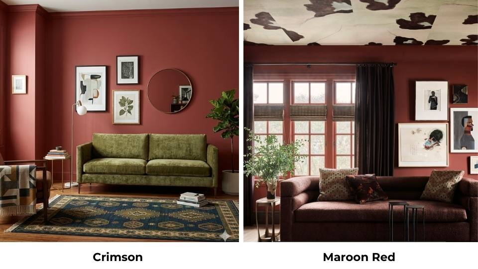
Crimson Vs Burgundy Vs Maroon
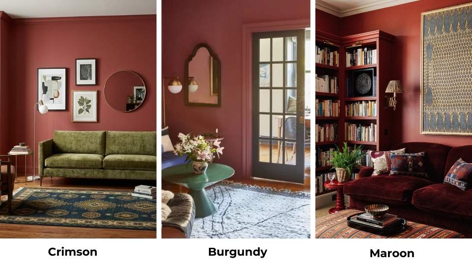
Maroon is the third one in the deep red family and it’s confused with burgundy.
Maroon is red mixed with brown. It comes from the French word “marron” meaning chestnut.
While burgundy has purple undertones, maroon is about the brown base, it’s earthy, muted and less sophisticated.
I tested these side by side when I was redoing my dining room. Crimson looked too bright for the space and burgundy looked expensive but formal.
Maroon looked boring, it’s warmer than burgundy but doesn’t have the same depth.
Crimson Vs Red
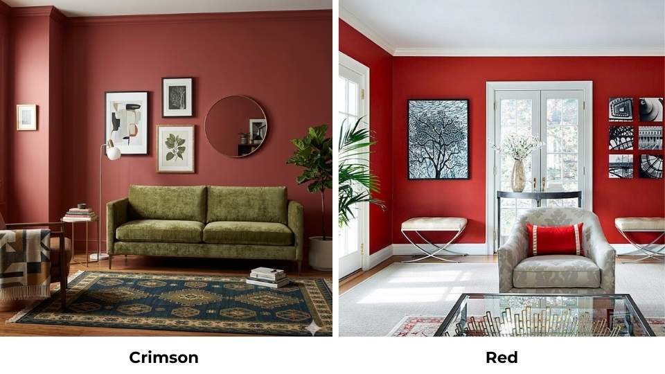
Pure red is RED, fire truck, primary color, no undertones, they have in it. Crimson adds the blue undertones that cool it down and make it complex.
When I hold up a true red paint swatch next to crimson, the crimson looks almost purplish and the red looks red. Crimson has personality but red has versatility.
Crimson Vs Scarlet
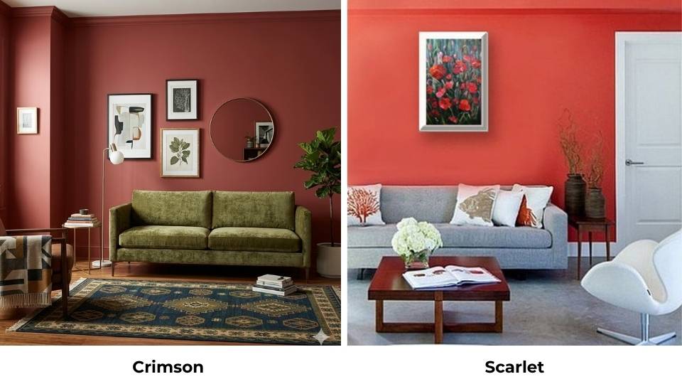
Scarlet has orange-yellow undertones where crimson has blue-purple ones.
Scarlet is the bright red-orange that feels energetic and warm. Crimson feels dramatic and cool.
I used scarlet in my entryway instead of crimson and the scarlet felt playful and too orange.
Crimson had the seriousness I wanted.
Scarlet Vs Burgundy
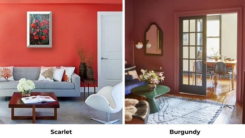
Scarlet is one of the warm reds with the orange undertones. Burgundy is cool with purple and brown.
Scarlet energizes, burgundy soothes, scarlet is daytime, burgundy is evening.
Bright Red Vs Burgundy
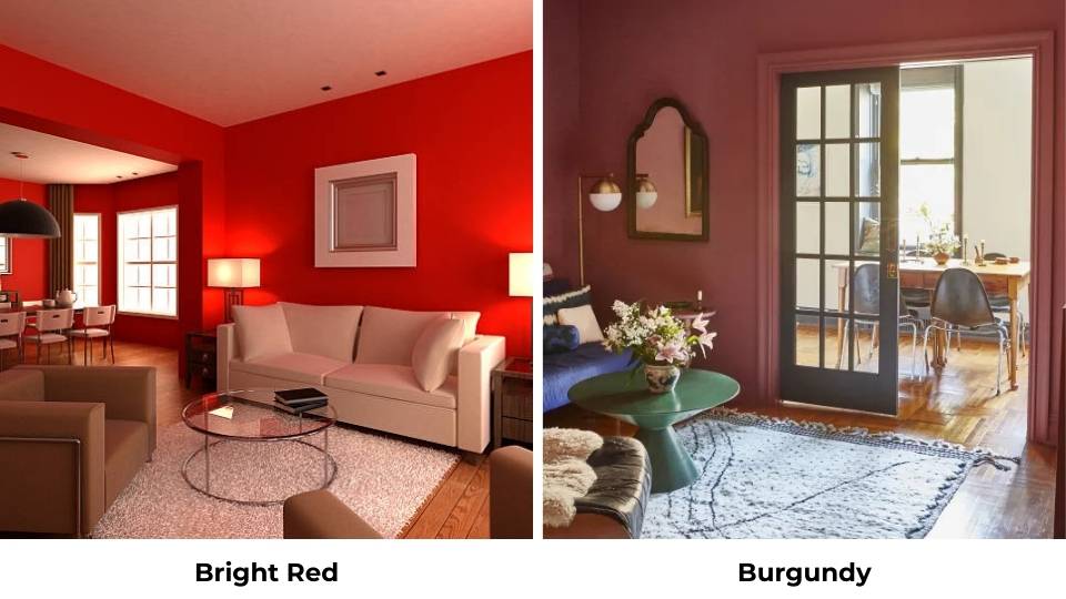
Bright red like pure primary red is light and more saturated than burgundy. Burgundy is dark, muted and complex.
Bright red demands attention like crimson but without the cool sophistication. Burgundy invites you in but the bright red announces.
Crimson Vs Maroon Red
Crimson is bright, cool and blue-based. Maroon red is dark, warm,and more brown-based.
Crimson makes a statement, maroon plays it safe. I’d use crimson in a modern space and maroon in a traditional one.
| Color | Undertone | Brightness | Best For | Temperature |
| Crimson | Blue/purple | High | Modern spaces, accents | Cool |
| Burgundy | Purple/brown | Low | Traditional rooms, bedrooms | Cool to neutral |
| Maroon | Brown | Low | Institutional, conservative | Warm |
| Scarlet | Orange/yellow | High | Energetic spaces | Very warm |
| Pure Red | None | Medium-high | Versatile applications | Neutral |
| Bright Red | Minimal | Very high | Attention-grabbing | Neutral to warm |
Conclusion
Here’s what I wish I had known before I got with Crimson Vs Burgundy.
Crimson and burgundy aren’t interchangeable, and pretending they are will cost you time, money, and your sanity.
Crimson is used when you want energy, drama, and impact but make sure you’ve the lighting and the confidence to back it up.
Burgundy is used when you want depth, warmth, and the expensive feeling without looking for attention.
I keep both colors in my home because I’ve learned they have different purposes. My entryway gets crimson because I want the amazed feeling.
My bedroom is burgundy because I need to decompress there.
Test your colors in the space with the lighting before you commit because the small paint swatches don’t justify the shade properly.
Buy peel-and-stick samples and live with them for a few days before deciding.
FAQs On Crimson Vs Burgundy
No, burgundy is dark with purple and brown undertones while crimson is bright with blue undertones. They’re both reds but create different moods. I learned this the expensive way.
Scarlet is the closest, it is warm with orange undertones and pure red is also similar but without crimson’s cool blue complexity. If you want something less intense than crimson, try a bright red.
It is called burgundy now too but you’ll also know it as wine red, oxblood, or deep red. Paint companies use different names but if you see “burgundy” on the label, it is the purple-brown red.
Maroon is the closest but brown and less purple. Wine red is another name for burgundy. If you want something light, go with a deep red with purple undertones. Avoid anything which is named as “crimson” because it is with something different.
Crimson Vs Burgundy: A Complete Comparison Guide