So you’re choosing between Ballet White and Swiss Coffee. These two Benjamin Moore colors look identical at first look but have different personalities once you put them on walls.
Both are warm neutrals that live in the spot between white and greige territory, and they can look similar on the small paint swatches. The Ballet White Vs Swiss Coffee debate is real.
Swiss Coffee and Ballet White both promise the cozy, not-too-white vibe that works.
Lighting changes them. Your furniture changes them. Even your flooring can make one look amazing and the other look off.
I’ve used it in modern builds, traditional homes, farmhouses, and the transitional spaces where nothing works. But picking the wrong undertone and the space feels wrong.
Here in this post, I’m breaking down everything about Ballet White Vs Swiss Coffee.
The undertones, LRV numbers, how they look in different rooms, what mistakes to avoid, and which one deserves a spot in your home.
Here are my other blogs that you can also read:
- Soft Chamois Vs Swiss Coffee
- Sw Extra White Vs Pure White
- Peppercorn Vs Iron Ore
- Drift Of Mist Vs Alabaster
- Manchester Tan Vs Accessible Beige
About Ballet White (Benjamin Moore OC-9)
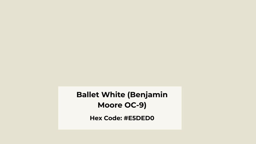
Ballet White is in a middle ground that Benjamin Moore classifies as a warm off-white, but it’s more of a light greige.
It has beige and soft greige undertones that give it depth. When I first tested it in a client’s living room, I expected it to look as white but it didn’t.
It looked muted, a warm neutral that felt expensive and calm.
The LRV of Ballet White is around 73, which means it’s warm and deeper than other whites.
It doesn’t bounce light around,but it absorbs some of it and creates a soft, enveloping feel.
The color appears creamy without being yellow, soft without looking dirty, and muted.
I use Ballet White in living rooms where people want warmth but not the beige. Works beautifully in bedrooms where you want something cozy but neutral for any bedding color.
Exteriors too, especially on modern farmhouse builds where harsh white feels too harsh.
Designers love it because it’s predictable. Homeowners love it because it doesn’t flash other colors.
About Swiss Coffee (Benjamin Moore OC-45)
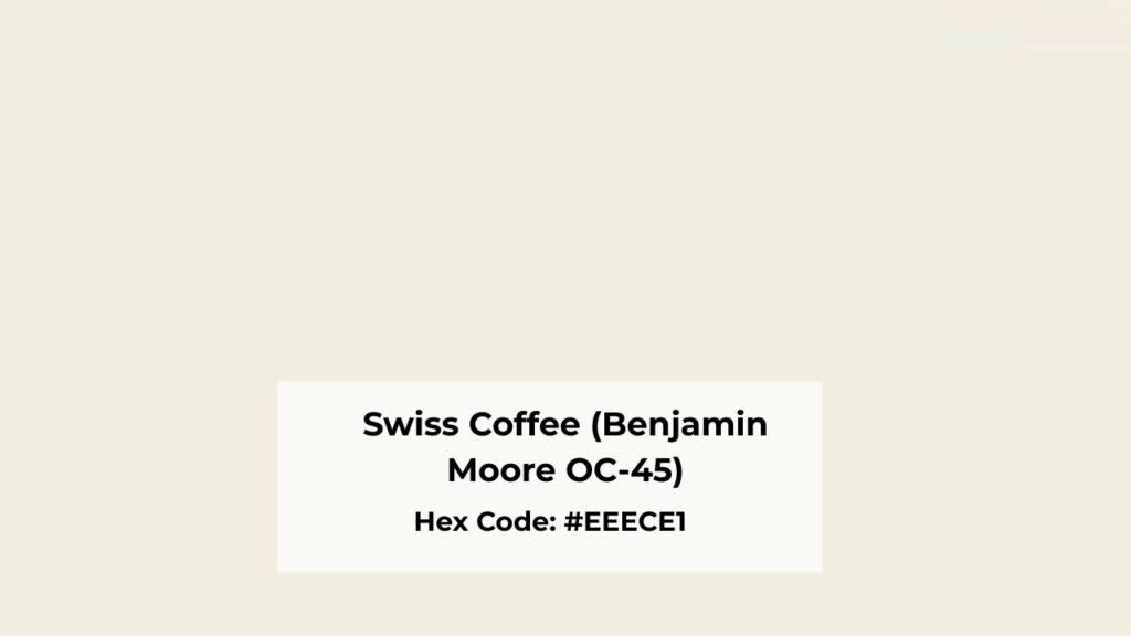
Swiss Coffee is what Benjamin Moore calls a warm off-white with soft creamy undertones and subtle beige warmth. Swiss Coffee is different.
The warmth in Swiss Coffee is permanent. It has a creamy quality that looks not white when you put it on the wall.
Swiss Coffee can lean yellow or slightly green depending on your lighting.
I’ve seen it happen in north-facing rooms, in spaces with cool LED bulbs, and when it’s next to cool trim colors.
The LRV is around 83, making it bright and more reflective than Ballet White.
In rooms with great natural light, it looks soft and creamy and lovely. But in dim hallways or spaces without windows, it can look heavy.
Swiss Coffee works beautifully in traditional interiors. Old farmhouses with warm wood floors. Cottages with vintage charm.
Spaces where you want warmth. I’ve used it in living rooms with honey oak or walnut furniture and it’s perfect.
But in modern homes with cool marble or gray-blue accents, it games against everything.
What is the Difference Between Ballet White and Swiss Coffee?
Look, these colors look similar until you compare them side by side, and then you can’t ignore the differences.
Swiss Coffee is bright, creamy, and has the clear warm look that announces itself. So let’s go and look at the details that matter.
LRV
Light Reflectance Value is a way of saying “how much light does this color throw back at you.”
Swiss Coffee is at an LRV of 83, which puts it in bright territory. It reflects light, makes rooms feel big and airy.
Ballet White has an LRV of 73. The ten-point difference matters. Ballet White absorbs light, which gives it the grounded, sophisticated feel but also means it won’t brighten up a dark room the way Swiss Coffee will.
In a south-facing room with natural light, the lower LRV works better, it doesn’t wash out or look flat.
But if you’re working with a dim space, Swiss Coffee’s high LRV is better.
Undertones
Swiss Coffee’s primary undertone is creamy yellow with soft warmth. In some lighting, especially northern exposure or rooms with shadows, the yellow can shift green.
I’ve seen it many times to warn people. It’s visible when you pair Swiss Coffee with cool whites on the trim or with blue-leaning tile.
Ballet White has beige as its primary undertone with soft gray as the secondary player. There’s warmth, but it’s restrained and balanced.
The beige-gray combo means it shifts with different lighting instead of flashing one strong color.
Lighting Affect
Swiss Coffee in bright daylight looks creamy and soft. But in low light or evening hours with warm artificial lighting, the creamy tone intensifies.
The yellow undertones get strong, and the whole room can start feeling darker than a color with an 83 LRV.
Ballet White handles lighting changes like a pro. Bright daylight brings out its soft neutral warmth. Low light makes it cozy without turning yellow.
Artificial lighting, whether warm Edison bulbs or cool LEDs, doesn’t throw it off balance. This is why I use Ballet White for home color schemes.
Understanding how lighting affects your paint color isn’t optional. It’s the difference between loving your walls and repainting in six months.
Style and Best Uses
Swiss Coffee works best in traditional spaces like farmhouse kitchens with butcher block counters, cottage bedrooms with wood furniture, vintage homes where that creamy warmth feels intentional and cozy.
Pair it with warm wood tones, aged brass hardware, and soft textiles. For trim, you’d need to go warm or worry about the contrast looking off.
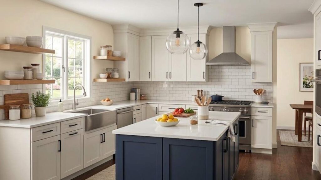
Ballet White thrives in transitional and modern organic spaces. It’s perfect for open floor plans where you need one color to work. Use it with both warm and cool accent colors.
Pair it with white oak flooring, marble countertops, black windows, brass fixtures, it plays well with everything.
For trim, Benjamin Moore Simply White or White Dove creates beautiful contrast.
| Aspect | Swiss Coffee (OC-45) | Ballet White (OC-9) |
| LRV | ~83 (brighter) | ~73 (softer, deeper) |
| Undertones | Creamy yellow, soft warmth | Beige, soft gray |
| Lighting Risk | Can lean yellow/green | Very stable |
| Best Style | Traditional, farmhouse, cottage | Transitional, modern, contemporary |
| Trim Pairing | Needs warmer or matching whites | Works with Simply White, White Dove |
| Overall Feel | Cozy, creamy, obvious warmth | Elegant, muted, balanced warmth |
Which Color Suits Best In Different Types of Rooms? Ballet White Vs Swiss Coffee
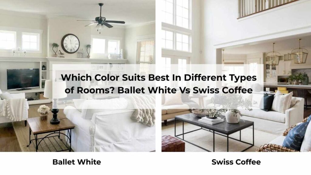
Choosing the right color for each room isn’t about what looks pretty in pictures.
It’s about how that color looks in your space with your lighting and your furniture.
I’ve tested both Ballet White Vs Swiss Coffee in every room type, and they have preferences.
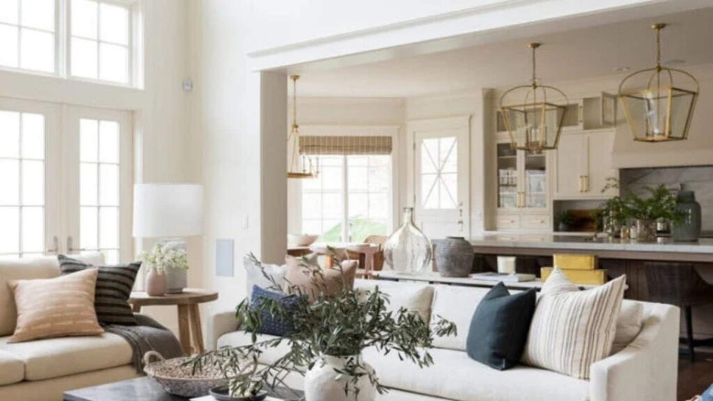
Living Room
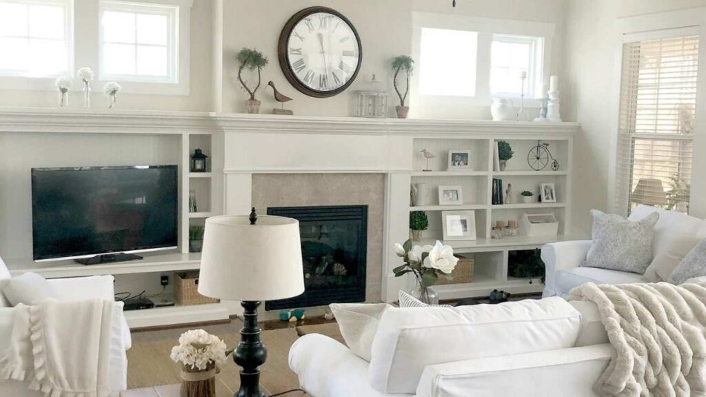
Ballet White in a living room creates a calm, pulled-together backdrop that doesn’t compete with your furniture or art.
The muted warmth makes the space feel finished without trying hard.
I used it in an open-concept living room with north AND south-facing windows, and it looked balanced in both exposures.
The beige-gray undertones kept it from looking too warm in the bright southern light while feeling cozy in the cool northern sections.
Swiss Coffee in a living room brings obvious warmth and works beautifully IF your space has warm elements to support it.
Honey oak floors, warm leather furniture, brass accents, then Swiss Coffee amplifies the coziness.
But in a modern living room with cool gray sectionals and chrome fixtures, it can look out of place.
Bedroom
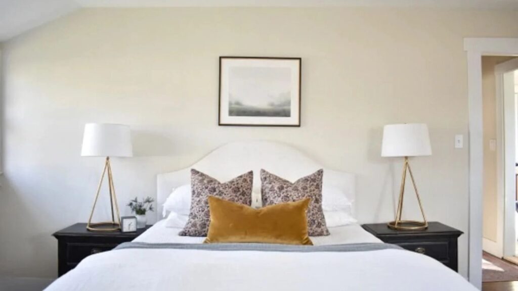
Ballet White in bedrooms is my go-to when people want something warmer than white.
The soft, muted quality creates a restful vibe without feeling too anything, not too bright, not too dark, not too warm, not too cool.
It works with white bedding, colored bedding, wood furniture, upholstered beds.
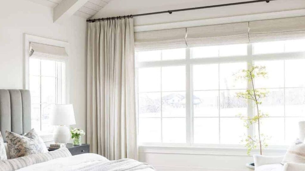
Swiss Coffee in bedrooms feels cozy and enveloping, which some people LOVE for sleep spaces. The creamy warmth can make a bedroom feel like a retreat.
But if your bedroom gets cool morning light or you have cool toned furniture, Swiss Coffee can look more yellow.
Bathroom
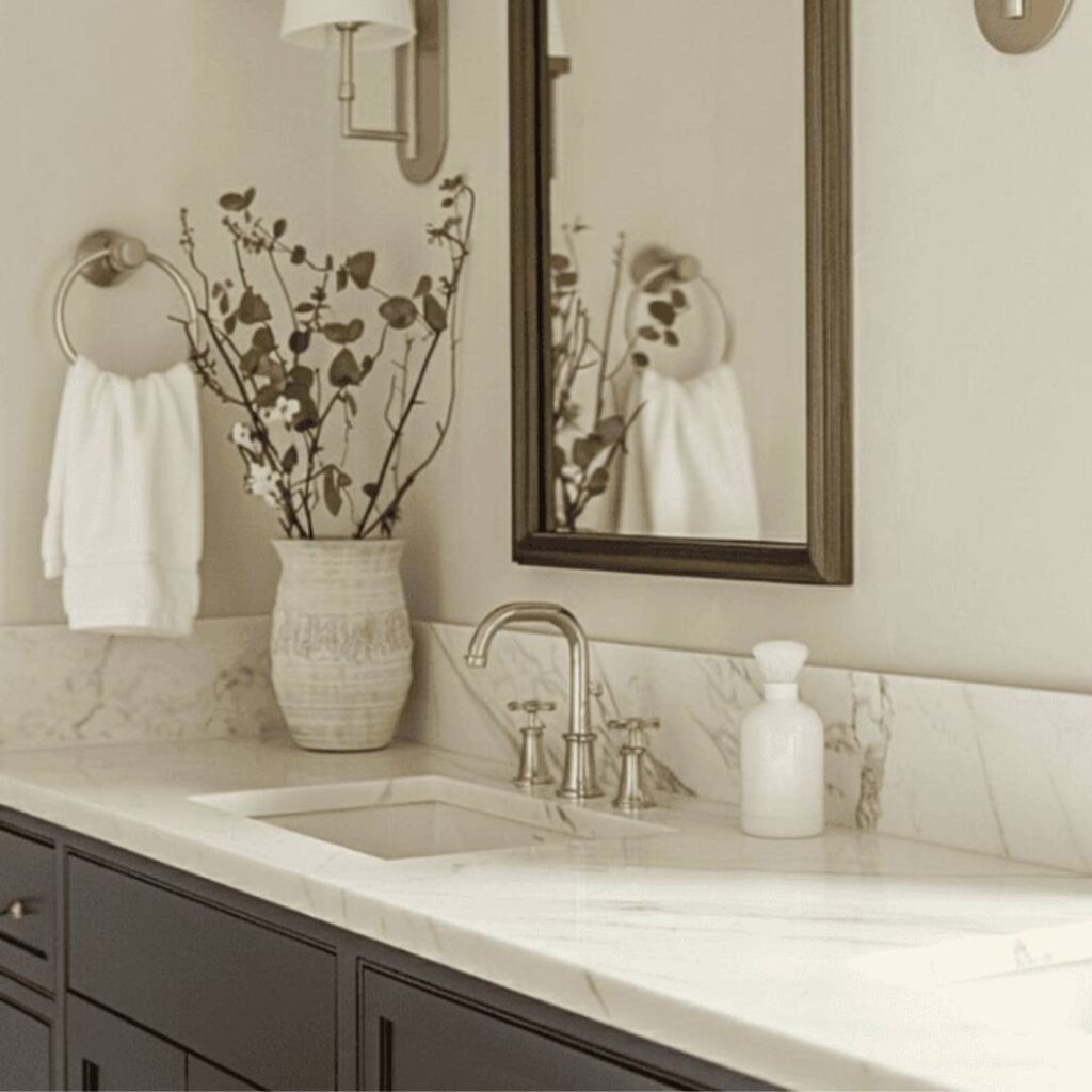
Ballet White in bathrooms pairs well with white fixtures, marble tile, subway tile, and with any finish you’d use.
The beige-gray undertones complement both warm and cool materials without looking off.
I’ve used it with brass faucets, matte black hardware, chrome fixtures and it cooperates with all of them.
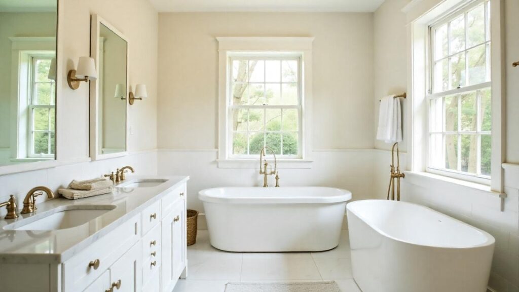
Swiss Coffee in bathrooms needs more careful planning. It works with warm marble, cream subway tile, and brass or gold fixtures.
But next to bright white porcelain or cool gray tile, that yellow undertone becomes really obvious. Not bad, necessarily, just very present.
Kitchen
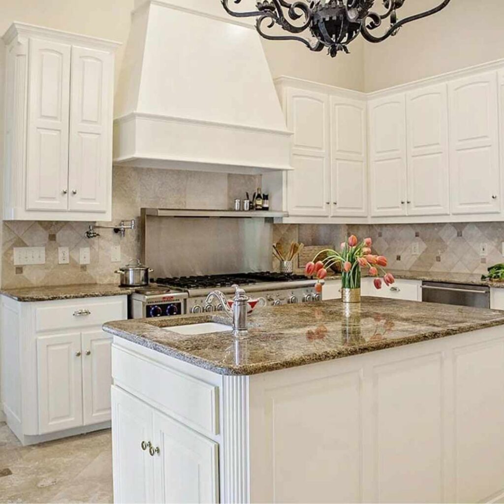
Ballet White in kitchens is perfect for cabinets or walls. Pairs with white countertops, warm wood countertops, cool quartz, stainless appliances, black appliances.
The depth it has means it doesn’t wash out in bright kitchen lighting, which happens with light whites.
Swiss Coffee in kitchens creates a warm, traditional feel that’s gorgeous with the right setup.
Warm wood floors, butcher block counters, oil-rubbed bronze hardware. But with cool white quartz and stainless steel, it looks too yellow.
I’ve repainted more than one kitchen because the homeowner picked Swiss Coffee without testing.
Ballet White Vs Swiss Coffee Vs Other Colors
Okay, so you’re wondering how these look against other popular whites because why make life simple when you can compare other identical paint swatches.
Comparing Ballet White and Swiss Coffee to other warm whites helps you understand where they are on the color wheel.
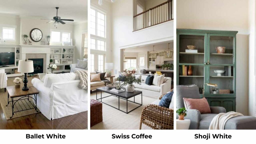
Ballet White Vs Shoji White
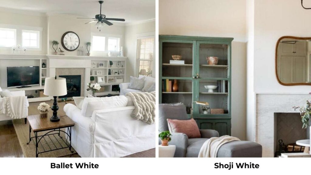
Shoji White is bright and cleaner than Ballet White, with less undertones.
If Ballet White feels too deep or muted for your space, Shoji White gives you warmth without color depth.
It has a middle ground between true white and Ballet White’s greige territory.
Ballet White Vs White Dove
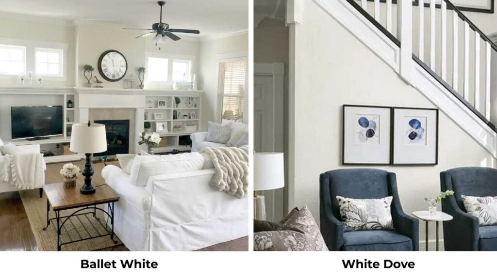
White Dove is brighter than Ballet White LRV around 83 vs 73 and has warmth.
It’s a better choice if you want something that looks white but has a soft warm quality.
Ballet White is better if you want something that looks neutral with warmth.
Ballet White Vs Natural Cream
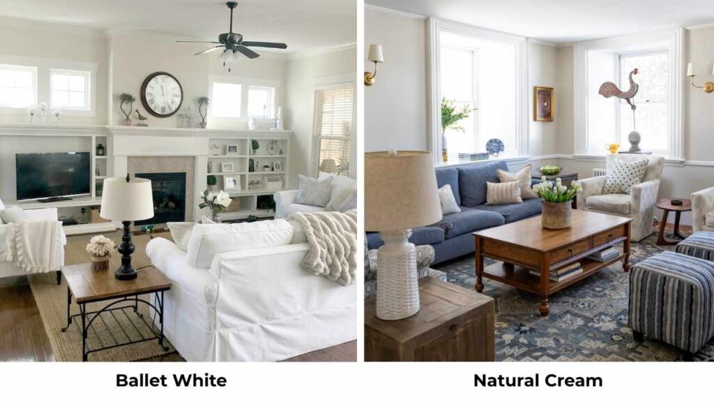
Natural Cream is into beige territory than Ballet White. It is about more color, more warmth, less versatility.
Choose Natural Cream if you want a beige-leaning neutral. Choose Ballet White if you want the neutral version of warmness.
Swiss Coffee Vs Alabaster
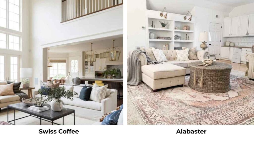
Sherwin Williams Alabaster is similar in warmth to Swiss Coffee but less yellow. Many designers use Alabaster instead of Swiss Coffee because it’s predictable and less likely to flash green undertones.
Swiss Coffee Vs White Down
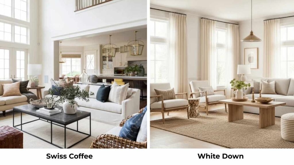
White Down is soft and less creamy than Swiss Coffee. It has warmth but it’s more restrained.
If Swiss Coffee feels too heavy or too yellow in your space, White Down may give you the warmth you want with less risk.
Swiss Coffee Vs Timid White
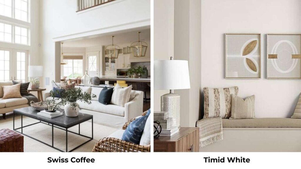
Timid White is lighter and cooler than Swiss Coffee. It has some warmth but is much closer to true white.
Choose Timid White if you want barely-there warmth. Choose Swiss Coffee if you want warmth that’s visible.
| Comparison | Key Difference | Choose This If… |
| Ballet White vs Shoji White | Shoji White brighter, cleaner | You want warmth with less depth |
| Ballet White vs White Dove | White Dove brighter, reads more as white | You want clear warmth that still feels like white |
| Ballet White vs Natural Cream | Natural Cream more beige | You want obvious beige tones |
| Swiss Coffee vs Alabaster | Alabaster less yellow, more predictable | You want warmth without yellow risk |
| Swiss Coffee vs White Down | White Down softer, less creamy | Swiss Coffee feels too heavy |
| Swiss Coffee vs Timid White | Timid White cooler, lighter | You want barely-there warmth |
Common Mistakes to Avoid While Going with Ballet White and Swiss Coffee
Let me save you from the mistakes I’ve made and watched other people make with these colors.
Testing in only one lighting condition: Paint samples and look at them in morning light, afternoon light, evening with your artificial lights on.
Both colors shift, and you need to see all versions.
Assuming Swiss Coffee will look like photos you saw online: Studio McGee uses Swiss Coffee lighter than the standard formula, which is NOT what you’ll get if you order Swiss Coffee.
Ignoring your existing finishes: Ballet White and Swiss Coffee both look different next to cool marble vs warm wood vs stainless steel.
Not testing trim colors: Your wall and trim colors need to work together. Don’t assume any white will work for trim with either of these colors.
Using Swiss Coffee in north-facing rooms without testing: That’s where the green undertone loves to appear.
Picking Ballet White when you need brightness: If your room is dark and needs light bouncing around, Ballet White’s 73 LRV may not be it.
Painting the house without testing in each room: Even “whole house colors” can look different in different spaces.
Conclusion
So comparing between Ballet White Vs Swiss Coffee, it depends on what you’re working with and what you want.
Ballet White is a safe, versatile choice for modern and transitional homes.
It adapts to different lighting, plays well with both warm and cool finishes, and doesn’t have hidden undertones.
Swiss Coffee brings more warmth and works beautifully in traditional spaces with warm materials, but it needs more consideration about where it will look best.
It’s easy, predictable, and works in many situations. Test both in your space. Live with the samples for at least a few days.
Trust what you see in your lighting with your furniture. And remember picking the wrong color will make your space feel off.
Choosing between Ballet White Vs Swiss Coffee can be confusing but not tough.
FAQs On Ballet White Vs Swiss Coffee
Choose Ballet White if you want a versatile, muted warm neutral that works in modern, transitional, and contemporary spaces with both warm and cool finishes. Choose Swiss Coffee if you want creamy warmth in a traditional, farmhouse, or cottage style.
They’re too similar in value but have different undertones that would compete rather than complement each other. If you used Ballet White on walls, go with Simply White or White Dove for trim instead of Swiss Coffee.
White Dove is better for most applications because it’s bright, predictable, and less flash yellow or green undertones. It gives you similar warmth without the factors that come with Swiss Coffee.
Ballet White is warm, but it’s a restrained, muted warmth with beige and soft gray undertones. It doesn’t look warm like Swiss Coffee does but it’s a balanced neutral that leans warm rather than cool.