Benjamin Moore Wrought Iron and Sherwin-Williams Iron Ore are two dark charcoal paint colors that people mistake for black.
They’re not black or not close when you look at them in the right light.
These two colors from Benjamin Moore and Sherwin-Williams are the most popular “almost black” options.
Wrought iron vs iron ore paint, comes up when you are comparing it for something dark.
Both colors show up in modern and transitional homes.
Designers love them and homeowners obsess over them but they’re not interchangeable.
Wrought Iron has a soft, warm vibe while Iron Ore has a cool and dramatic vibe.
The undertones are everything you need to consider before going with it.
We’re comparing Wrought iron Vs Iron ore like their appearance, LRV, how they look in different rooms and lighting situations, what whites and accent colors work with each, and when to choose one and some comparisons with other dark colors.
Here are my other blog posts that you can also read:
- Woodlawn Blue Vs Palladian Blue
- Perfect Greige Vs Agreeable Gray
- Tricorn Black Vs Black Magic
- Liveable Green Vs Softened Green
- Alabaster Vs Shoji White
Benjamin Moore Wrought Iron Color Breakdown (2124-10)
Wrought Iron is a deep charcoal gray with softness considering how dark it is, it’s not harsh.
That’s the first thing people notice when they see it on a wall.
The subtle blue and gray undertones keep it from going flat or lifeless, which happens with some dark colors.
This color works well in modern interiors but transitions well into traditional spaces.
I’ve used it in contemporary living rooms where it creates this sophisticated backdrop without being aggressive.
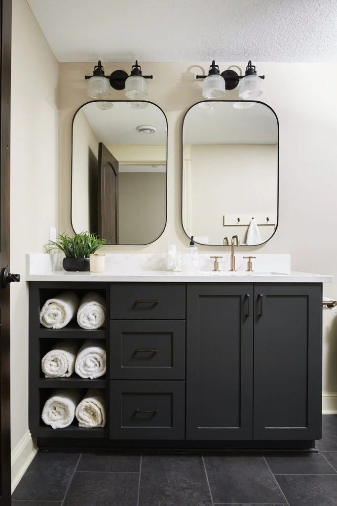
In bathrooms, mainly powder rooms with good lighting, it feels luxurious.
Bedrooms are where Wrought Iron shines.
The cool blue undertones bring a calm, meditative quality.
Not cozy but more refined and intentional.
I had one client paint their primary bedroom in Wrought Iron with Simply White trim and white bedding and it looked stunning.
The color has depth to create drama but softness to not feel cave like.
For exteriors, it’s the go-to for front doors and shutters.
The blue-gray undertones look well and expensive.
It pairs with brick, stone, light siding, almost everything.
I’ve seen it on modern farmhouse exteriors and sleek contemporary builds.
Light Reflectance Value is at 6.16, so yeah, it’s absorbing the light in your room.
Natural light during the day reveals the beautiful undertones.
Evening artificial light is dark, close to black.
Sherwin Williams Iron Ore Color Breakdown (SW 7069)
Iron Ore is a dark charcoal that is closer to black than Wrought Iron.
If you’re going for drama, this is your color because it’s heavy and moody.
It makes a statement whether you want it to or not.
The undertones are where it gets interesting.
Cool with hints of blue and green depending on your lighting and depending on lighting.
In the North-facing room it creates cool undertones.
In the south-facing with natural light it has a green influence, which sounds weird but looks incredible.
This color has become popular in modern and contemporary spaces.
I’m seeing it everywhere on kitchen cabinets.
It creates this grounded, substantial feeling that builder-grade brown cabinets can’t make.
In living rooms, Iron Ore works best as an accent wall or for built-ins.
All four walls have excellent natural light and a confident design sense.
It can overwhelm a space if you’re not careful.
Bathrooms are another application, if you’re going for that spa-like or hotel-inspired aesthetic.
Pair it with white marble or zellige tile. Bedrooms can handle Iron Ore but it’s a bolder choice than Wrought Iron.
For exteriors, Iron Ore performs nicely.
It’s become the modern alternative to boring black shutters.
Front doors, garage doors, exterior trim against lighter siding are solid choices.
LRV is 6, so identical to Wrought Iron in terms of light absorption.
Both are going to darken your space.
What is the Difference Between Wrought Iron and Iron Ore?
From across the room, many people won’t notice a difference.
But put samples side by side for differentiation.
Wrought Iron is warmer with the blue-gray undertones, while Iron Ore is cool with brown-earthy notes that create a different atmosphere.
The impact they make varies depending on your room’s natural light, ceiling height, and what you’re pairing them with.
LRV
Light Reflectance Value tells you how much light a color reflects back.
Zero is absolute black, 100 is pure white.
Anything under 10 is considered dark and will reduce the brightness of your space.
Wrought Iron comes in at 6.16. Iron Ore is at 6.
The 0.16 difference is not something you’d notice.
Both colors absorb 94% of the light hitting them. What this means is your room will be dark.
If you have limited natural light, these colors will intensify.
South-facing rooms with large windows can handle these darks better than north-facing rooms.
Undertones
Wrought Iron has cool blue-gray undertones that create a sophisticated, elegant quality.
In spaces with warm wood floors or furniture, the cool undertones become noticeable.
Iron Ore carries warm brown and earthy undertones despite being a cool-toned charcoal.
But the warm undertones make it feel grounded and substantial.
It goes well with natural materials, warm metals, and organic textures.
Here’s what I do with clients, paint large samples (like 2′ x 2′ minimum) on different walls in the room.
Look at them in morning light, afternoon light, and evening with your artificial lighting.
The undertones will shift throughout the day.
Lighting Behaviour
Natural light reveals the true character of both colors.
Wrought Iron in bright daylight shows the blue-gray notes and looks light.
It has depth that invites you to look at it. Iron Ore in the same conditions reveals complexity.
Artificial lighting is confusing. Warm LED bulbs will make
Wrought Iron feel warm but won’t change its character.
Iron Ore under warm lighting can lose its cool edge and can be brownish.
Cool LED bulbs emphasize the blue undertones in Wrought Iron sometimes to an extreme.
Iron Ore under cool lighting maintains its integrity better and looks fresh.
The Color Rendering Index (CRI) of your bulbs matters too.
Cheap LED bulbs with low CRI make dark colors look muddy and flat. Invest in high CRI bulbs if you’re painting with these colors.
Mood and Atmosphere
Wrought Iron creates a refined, sophisticated atmosphere that feels intentional without being aggressive.
It’s the color you choose when you want drama but restraint.
In a living room, it makes the space feel curated and adult.
In a bedroom, it brings calm and quiet.
Iron Ore is bold, grounded, and makes an impact.
It creates attention and sets a strong mood. In the right space, it feels luxurious and powerful.
In the wrong space, it can feel oppressive.
It’s less versatile than Wrought Iron, but when it works.
Both colors work in modern, transitional, and contemporary styles.
Wrought Iron edges are more traditional-friendly while Iron Ore is more modern and industrial.
Style Compatibility
Wrought Iron pairs nice with:
- White or off-white trim
- Warm wood tones
- Brass and warm metallic hardware
- Soft neutrals like greige and warm whites
- Both modern and traditional furniture styles
Iron Ore pairs beautifully with:
- Bright white trim
- Cool-toned woods or painted furniture
- Matte black or chrome hardware
- Clean neutrals and stark whites
- Contemporary and minimalist aesthetics
Ceiling color matters more than people think.
Keep ceilings white with these dark walls unless you’re committed to the moody cave vibe.
| Feature | Wrought Iron | Iron Ore |
| LRV | 6.16 | 6 |
| Undertones | Cool blue-gray | Warm brown-earthy with cool blue-green |
| Overall Feel | Sophisticated, refined, soft | Bold, dramatic, heavy |
| Best Lighting | Works in lighting; reveals depth in natural light | Best with good natural light; cool undertones strong in north light |
| Style Compatibility | Modern, transitional, traditional-friendly | Modern, contemporary, industrial |
| Warmth Level | Cool but not stark | Cool with warm grounding |
| Best White Pairing | Simply White, White Dove | Alabaster, Pure White |
| Hardware | Brass, warm metals | Matte black, chrome |
Which Color Suits the Best in Different Rooms? Wrought Iron Vs Iron Ore
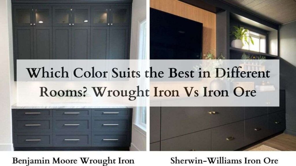
Room function, natural light, and your finishes impact which color will work in your space.
What looks stunning in the south-facing living room might feel oppressive in the north-facing bedroom.
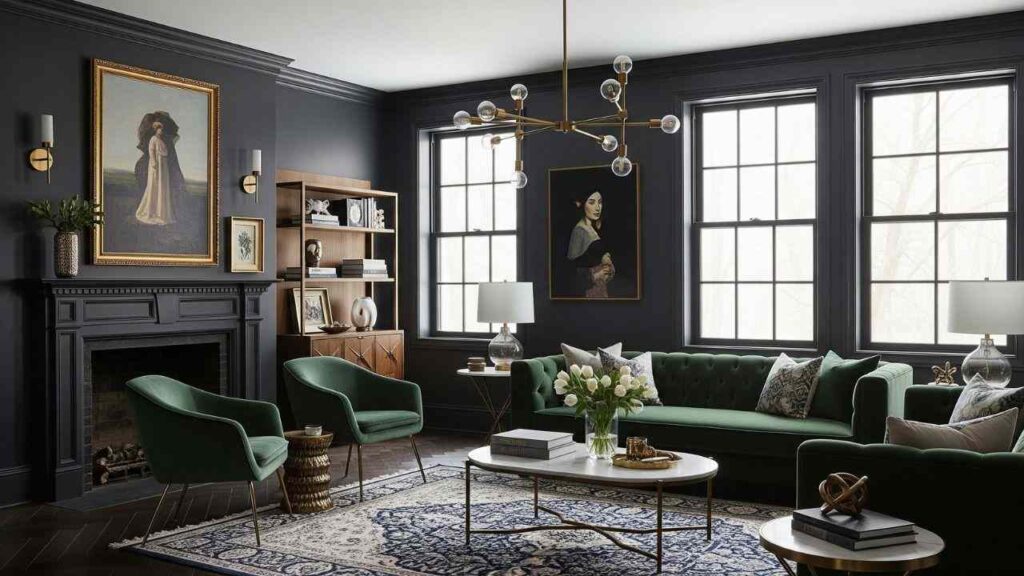
Living Room
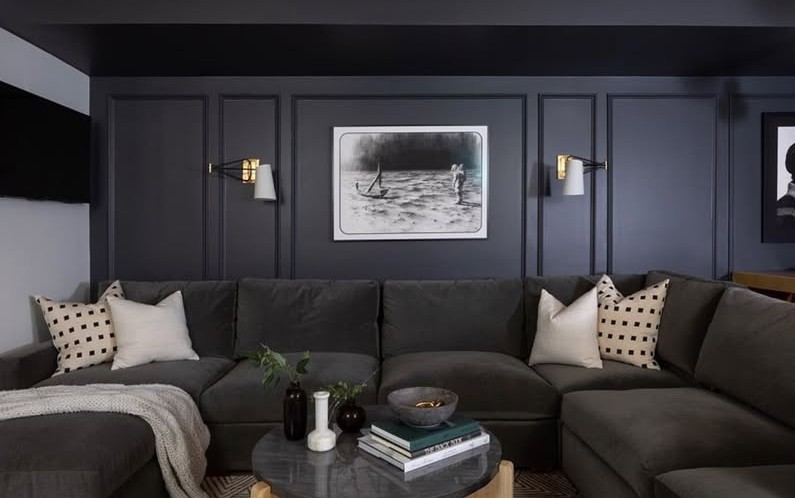
Wrought Iron in living rooms feels elevated without being pretentious. I use it on accent walls behind TVs or fireplaces where you want impact but not overwhelming darkness on the sides.
The blue-gray undertones work well with the mix of textures like leather sofas, wood coffee tables, fabric curtains.
It pairs well with warm neutrals on the other walls.
The color creates a sophisticated backdrop that makes your furniture and art pop without competing.
In open floor plans, it defines the living zone.
Iron Ore in living rooms makes a statement. This is the choice when you want drama and you have the natural light to support it.
It works well on built-ins and entertainment centers where the depth creates this architectural quality.
I’ve done Iron Ore accent walls in living rooms with south-facing windows and it’s stunning, the cool undertones balance the warm sunlight.
Bedroom
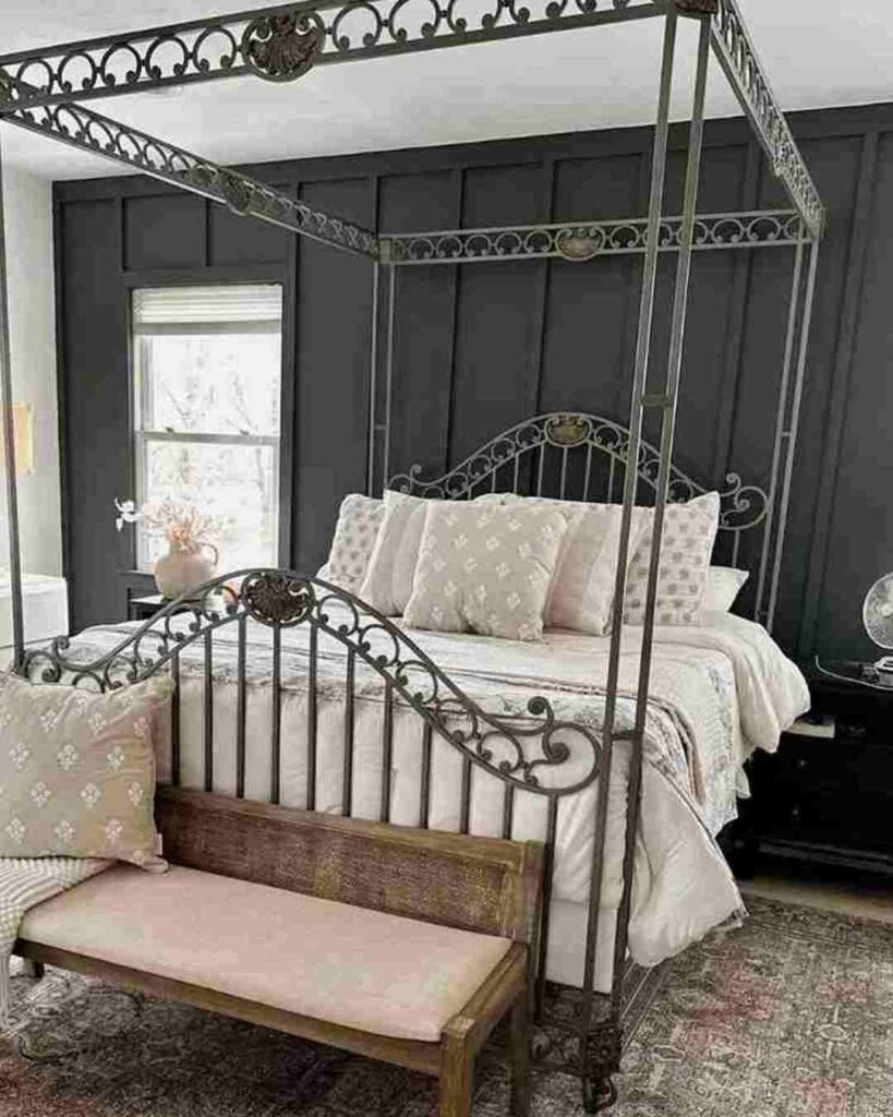
Wrought Iron creates a serene, cocoon-like bedroom that feels breathable.
The cool undertones bring a calm quality that helps with sleep.
It’s dark enough to block visual clutter but soft not to feel oppressive.
Pair it with white bedding, light wood furniture, and warm lighting. The contrast is beautiful.
I like it on the wall behind the bed as a focal point, but I’ve also done entire bedrooms in Wrought Iron with white trim and it works well.
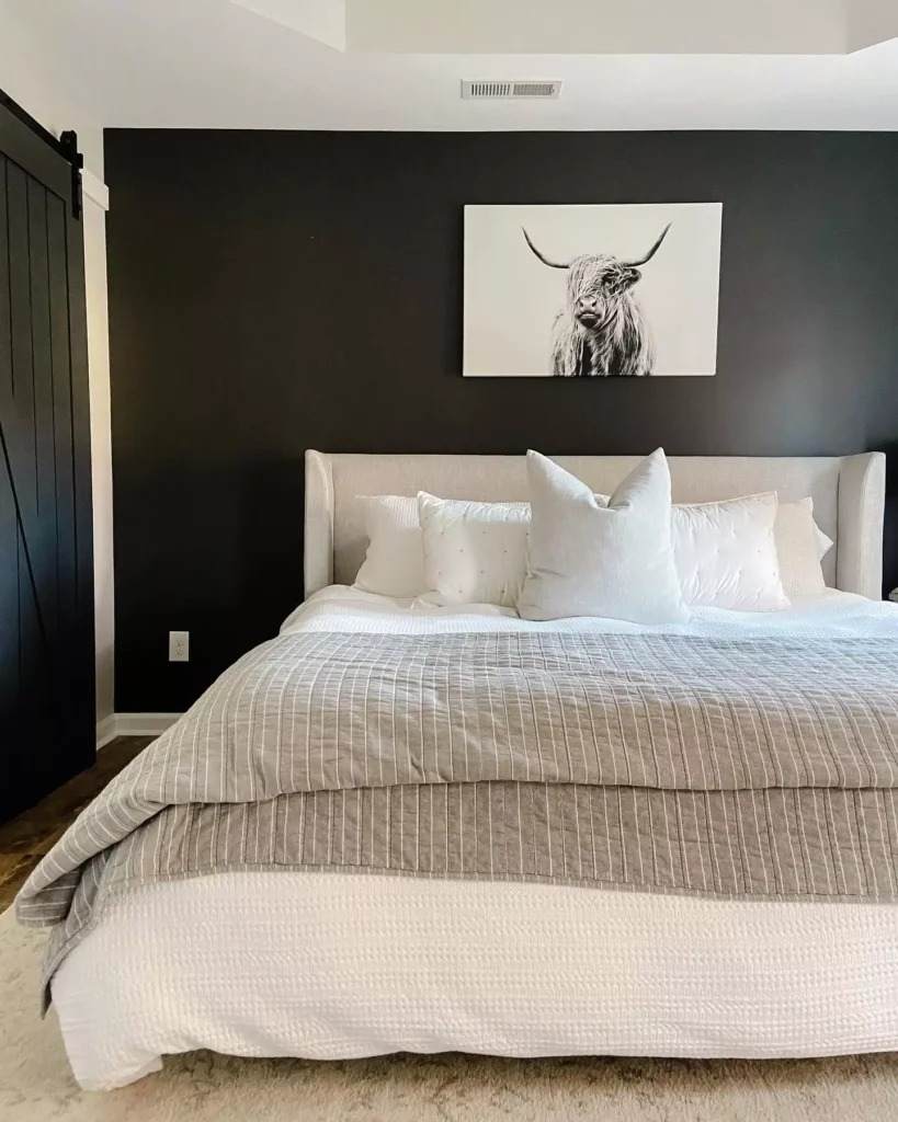
Iron Ore in bedrooms is for people who want bold. The mood is dramatic and intense.
If you prefer bright, airy spaces, Iron Ore will feel too heavy.
But if you like moody, cozy, dramatic spaces, it’s perfect.
Works best in large bedrooms with high ceilings.
Small bedrooms with Iron Ore on all walls can feel cave-like.
Bathroom
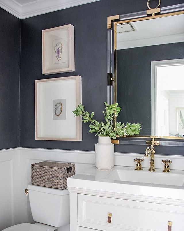
Wrought Iron in bathrooms brings this sophisticated spa feeling. I love it in powder rooms like you can go dark in a space.
The blue-gray undertones play nicely with white fixtures, marble, and chrome hardware.
In primary bathrooms, Wrought Iron works well on the vanity wall or as an accent behind a freestanding tub.
Pair it with white subway tile or marble and it creates a timeless look.
The softness of the color prevents the bathroom from feeling cold with the hard surfaces.
Iron Ore in bathrooms is dramatic and hotel-like. It demands attention and creates a strong mood.
Works beautifully with white marble, brass fixtures, and high-end finishes.
In a dated bathroom with builder-grade everything, it emphasizes the mismatch rather than elevates the space.
Powder rooms can handle Iron Ore because it’s a small space where drama is fun.
Primary bathrooms need good lighting to prevent the color from making the space feel dingy.
Kitchen
Wrought Iron on kitchen cabinets is having a moment and for good reason.
It’s sophisticated without being trendy. Works well on lowers with white uppers, or on an island as a contrasting statement.
The color adds depth and grounds the space, in kitchens with white and light wood.
On kitchen walls, Wrought Iron can work but be careful.
Kitchens have a lot going on visually with cabinets, counters, appliances, and backsplash.
A dark wall can either tie everything together or make it feel chaotic.
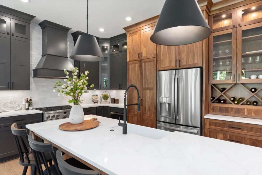
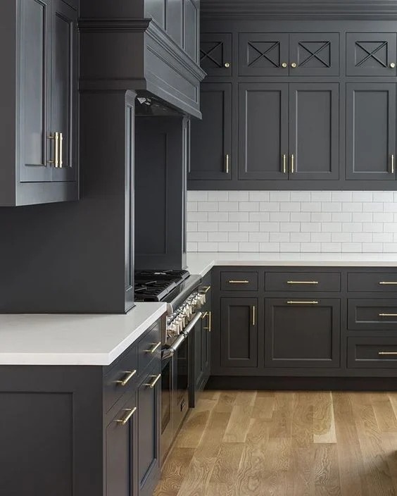
Iron Ore on kitchen cabinets is the bold choice. It’s become popular for modern and transitional kitchens, usually on lower cabinets or islands.
The dark color hides wear and fingerprints well and creates substantial, furniture-like quality.
As a wall color in kitchens, Iron Ore needs lighting.
Undercabinet lighting, pendant lights, and natural light working together.
Exterior
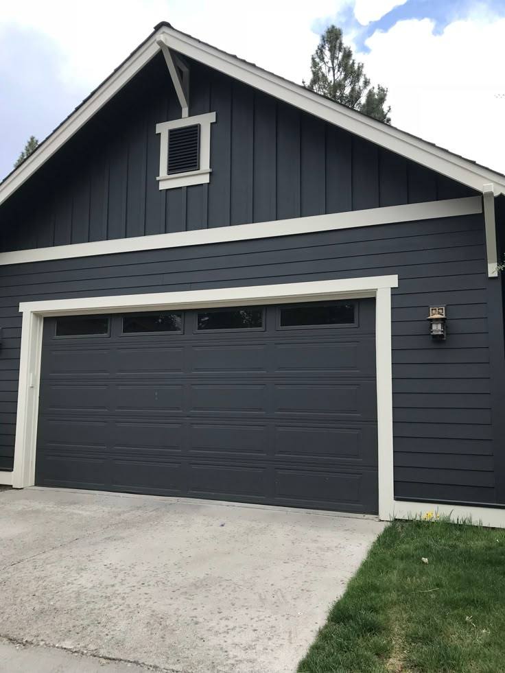
Wrought Iron on exteriors feels classic and expensive. Front doors, shutters, and trim all look beautiful in this color.
The blue-gray undertones look well and coordinate with any siding color.
It’s softer than true black on exteriors, which means it doesn’t create harsh contrast.
If you want drama without harshness, Wrought Iron is what you should consider.
It ages well and doesn’t show dirt.
Iron Ore on exteriors is bold and modern. It makes a statement on front doors, you can see why it’s everywhere on design blogs.
The color holds up in the sun without looking faded or dusty.
On large exterior surfaces like siding or trim, Iron Ore creates strong contrast against light colors.
It works well on contemporary homes and modern farmhouses.
The cool undertones look striking against white or light gray siding.
Wrought Iron Vs Iron Ore Vs Other Colors
People always ask about other dark colors once they start down this path.
Here’s how some popular alternatives compare.
Iron Ore Vs Peppercorn
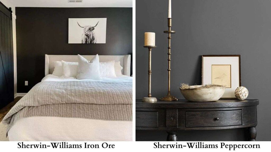
Peppercorn (SW 7674) is lighter than Iron Ore with an LRV around 11.
It is charcoal gray rather than almost black.
Peppercorn is the safe choice because it’s less dramatic, more versatile, easier to live with long-term.
The undertones are neutral with warm brown notes.
Choose Iron Ore when you want drama.
Choose Peppercorn when you want dark but not that dark.
Iron Ore Vs Urbane Bronze
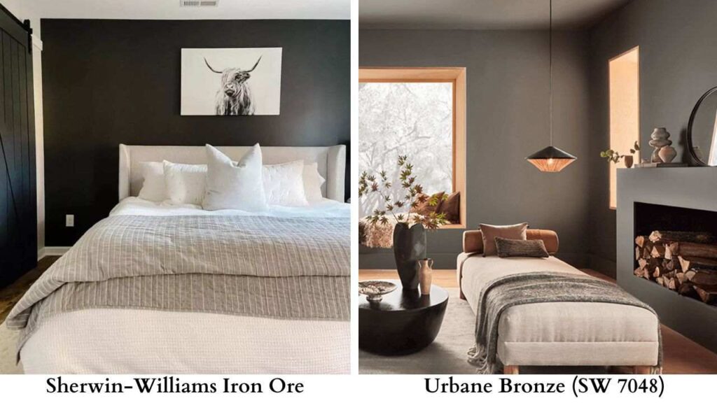
Urbane Bronze (SW 7048) is warm and browner than Iron Ore.
It is deep brown-gray with an LRV around 11-12.
The two colors can pair together on exteriors like Urbane Bronze on siding with Iron Ore trim creates depth.
Iron Ore is cool and modern. Urbane Bronze is warm and organic.
Iron Ore Vs Tricorn Black
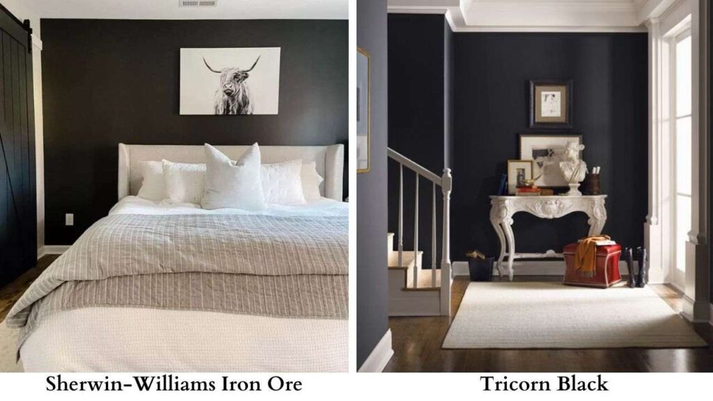
Tricorn Black (SW 6258) is true black with an LRV around 3. Iron Ore will look light and soft with Tricorn Black.
If you want black, Tricorn is your color. If you want dark charcoal with nuance, stick with Iron Ore.
I use both in the same project.
Iron Ore Vs Cyberspace
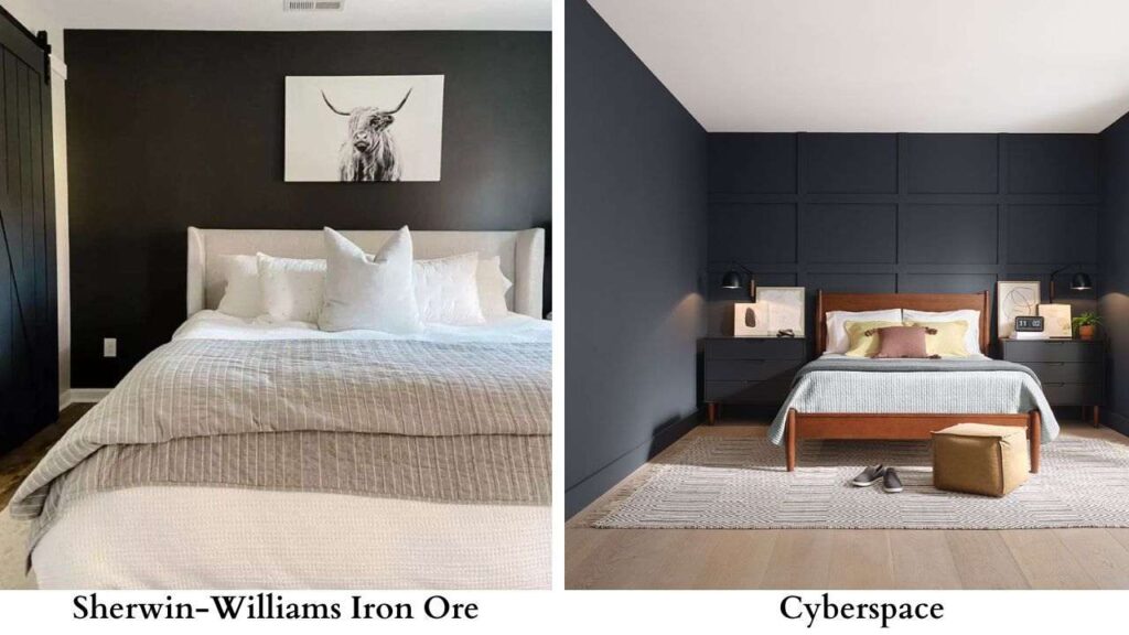
Cyberspace (SW 7076) is between Iron Ore and Peppercorn with an LRV around 7-8.
It’s a charcoal without strong undertones.
More neutral than Iron Ore, which makes it more versatile but less interesting.
Choose Iron Ore for the undertone complexity. Choose Cyberspace for neutral dark gray.
Wrought Iron Vs Pig Iron
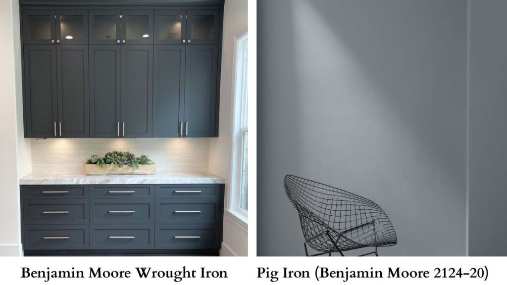
Pig Iron (Benjamin Moore 2124-20) is from the same color family as Wrought Iron but light with an LRV around 10.
It’s a soft, livable charcoal.
Pig Iron is what you choose when you like Wrought Iron but want less intensity.
Wrought Iron Vs Cast Iron Vs Pig Iron
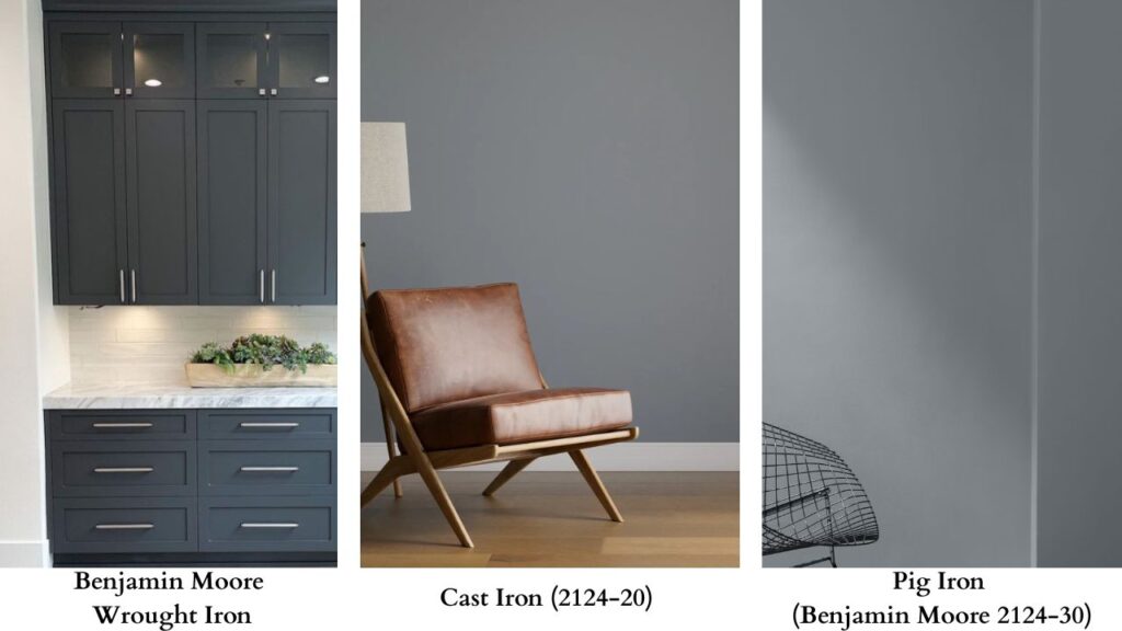
All three are from Benjamin Moore’s “iron” family:
- Wrought Iron (2124-10): Darkest at LRV 6.16, cool blue-gray
- Cast Iron (2124-20): Same as Pig Iron, medium dark at LRV ~10
- Pig Iron (2124-30): Lightest of the three, gray than charcoal
Think of them as light-medium-dark in the same color family.
You can use all three in one home for a cohesive palette with varying intensity.
Conclusion
Comparing between Wrought Iron Vs Iron Ore comes down to how drama you want and what undertones work with your existing space.
Wrought Iron is sophisticated depth with blue-gray coolness that feels refined and works with many design styles.
It’s a safe choice that delivers impact.
Iron Ore brings bold, moody drama with warm-cool complexity which creates memorable spaces when done right.
It’s less forgiving and needs strong lighting, but the result is worth it if that’s what you are looking for.
Both colors demand sampling in space with lighting.
Buy the samples and paint big swatches.
Live with them for a few days before deciding.
The color that looks perfect in someone else’s room can feel wrong in your bedroom.
So, comparing wrought iron vs iron ore paint can be confusing because of its darkness.