Pale Oak and Revere Pewter are two of Benjamin Moore’s most loved neutral paint colors, and these two are considered the most.
They both are in the warm-neutral color wheel.
Pale Oak Vs Revere Pewter comes in every color consultation I do because they’re both greiges which is the blend of gray and beige that works with everything and nothing at the same time.
Pale Oak is a light, warm greige that looks as an off-white in some spaces, while Revere Pewter is a medium-depth greige that has presence on the wall.
I’ve watched many homeowners grab a paint swatches when they need the other.
The undertones in these two are different, and picking the wrong one based on a small paint swatch under fluorescent store lighting can make or break your space.
So, I’m breaking down everything about Pale Oak Vs Revere Pewter, the LRV numbers, what the undertones do in different lighting, how they look room by room, and which one you should pick based on your space.
I’ll also throw in some comparisons with other popular colors and share some mistakes to avoid.
Here are my other blogs that you can also read:
- Tricorn Black Vs Iron Ore
- Agreeable Grey Vs Accessible Beige
- Balanced Beige Vs Accessible Beige
- Tricorn Black Vs Black Magic
- Perfect Greige Vs Agreeable Gray
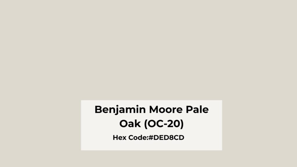
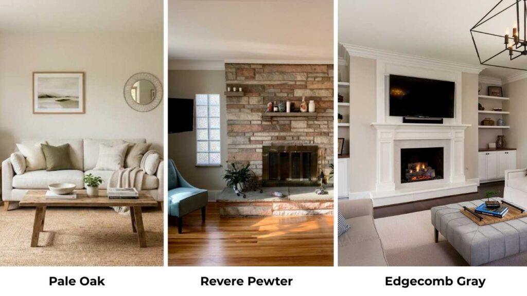
Overview of Benjamin Moore Pale Oak (OC-20)
Pale Oak (OC-20) is one of the colors that looks simple until you live with it.
It’s a light greige with a beige-taupe base and an LRV of 69, which puts it in the light category but some people call it a “dark white” which is accurate.
The undertones are where Pale Oak gets interesting.
It has warm undertones with hints of pink and violet that shows depending on your lighting and surrounding finishes.
I’ve used this color in many projects and it’s never looked the same twice.
The pink undertone is subtle but it’s there, and in some lights you’ll catch the soft violet.
Compared to Classic Gray, Pale Oak is rich and a touch dark but both are in the light range.
Classic Gray has the green-violet undertones and can feel cool, while Pale Oak stays warm.
The thing I love most about Pale Oak is that it maintains its warmth in cool or low-light rooms.
I used it in a north-facing bedroom and a death sentence for warm colors and it held onto the cozy feeling without going gray and sad.
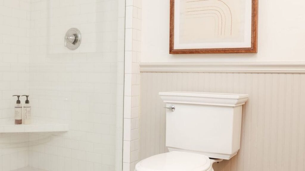
It works well in living rooms where you want that airy but warm vibe, and I’ve used it in bathrooms where it feels spa-like without being cold. Bedrooms are where it shines most.
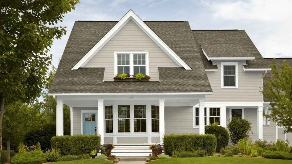
For exteriors, Pale Oak can be stunning on traditional or transitional homes. It’s light to feel fresh but has a depth that doesn’t look like white.
I’ve seen it on Craftsman-style homes with White Dove trim and dark accent colors, and it’s good.
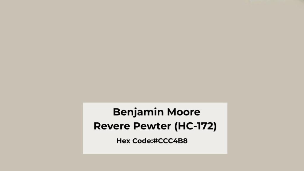
Overview of Benjamin Moore Revere Pewter (HC-172)
Revere Pewter (HC-172) is the most talked about greige in existence, and there’s a reason it’s in Benjamin Moore’s Historical Collection.
This color has serious staying power in the design world.
It’s a medium-depth greige with an LRV of 55, which puts it at the border between light and light-medium.
The difference between 55 and 69 is bigger than it sounds. Revere Pewter has weight to it.
The undertones are where people either love or hate this color.
Revere Pewter has a balanced mix of gray and beige with a green undertone.
The green can be beautiful with the right finishes like with natural stone, warm woods and the right countertops.
But pair it with the wrong elements and it can look muddy or swampy.
In low or moderate lighting, Revere Pewter appears warm and cozy.
It has an organic, earthy quality that works great in traditional and transitional spaces.
In bright spaces, it holds its color well without washing out.
The medium depth gives it presence that doesn’t disappear when the sun comes.
I see Revere Pewter used most in living rooms, dining rooms, and open-concept main floors.
It’s popular for kitchens too, mainly on cabinets when paired with backsplash and countertops.
For bedrooms, it works if you want something grounding rather than airy.
For exteriors, Revere Pewter is fantastic. It photographs well, has dimension, and looks as the classic greige that never feels dated.
What is the Difference Between Pale Oak and Revere Pewter?
Pale Oak Vs Revere Pewter, these two colors are in the same family but they’re NOT interchangeable, and mixing them up is one of the mistakes I have seen.
Understanding the differences will save you from repaint, which costs both money and your sanity.
LRV
Light Reflectance Value is how much light a color bounces back, measured from 0 (black) to 100 (white).
Pale Oak has an LRV of 69, making it lighter and more reflective.
It’s going to brighten a space, make it feel large, and work in rooms without natural light.
Revere Pewter sits at LRV 55, which is a full 14 points darker.
This doesn’t sound much but it’s a visible difference.
Revere Pewter absorbs more light, creates more contrast with trim, and adds visual weight to walls.
If you have a small, dark room and you paint it Revere Pewter expecting Pale Oak results, that room is going to feel small and dark.
Undertones
Pale Oak has taupe undertones with pink and violet influences. It is warm without going peachy or yellow.
The violet is subtle that many people don’t see, but it’s what keeps the color from feeling flat.
Revere Pewter has green undertones under the gray-beige blend. In most lighting conditions, that green is going to make an appearance.
Sometimes it’s a warm, sage- green that feels organic. Sometimes it’s prominent and can clash with finishes that have pink or purple undertones.
You should NOT use Pale Oak and Revere Pewter together in the same space or flowing into each other. The undertones will go against it.
Lighting Behaviour
Pale Oak in bright natural light gets light and can look as off-white.
In north-facing or low light, the warmth becomes obvious and the pink-greige tones come up. But it stays warm, which is its best thing.
Revere Pewter in bright light shows its balanced warm side, gray and beige playing nicely with that green undertone staying subtle.
But in low light or insufficient natural light, it can look flat, muddy, or emphasize the green.
I used Revere Pewter in a hallway once with minimal lighting and it looked sad and murky.
Remember, Pale Oak is forgiving in many lighting conditions. Revere Pewter NEEDS decent light to perform.
Warmth and Depth
Pale Oak creates warmth without depth. It’s soft, light, cozy but airy.
Revere Pewter creates warmth AND depth. It grounds a space, adds coziness that’s substantial, almost warm. It makes a statement while being neutral.
If you want a room to feel like a cloud go with Pale Oak. If you want it to feel like a comfortable, substantial space with presence go with Revere Pewter.
Styling and Best Uses
Pale Oak works best with:
- Soft white trim like Chantilly Lace or White Dove
- Light wood tones
- Minimal contrast styling
- Spaces where you want brightness maintained
Revere Pewter works best with:
- White Dove trim
- Natural stone and warm countertops
- Medium to dark accent colors
- Spaces with good natural light
| Aspect | Pale Oak (OC-20) | Revere Pewter (HC-172) |
| LRV | 69 (Light) | 55 (Medium) |
| Undertones | Taupe with pink/violet | Beige-gray with green |
| Best Lighting | Works in all lighting, excels in low light | Needs good natural light |
| Visual Weight | Light and airy | Grounded and substantial |
| Room Feel | Bright, spacious, soft warmth | Cozy, present, depth |
| Trim Pairing | Soft whites (Chantilly Lace, White Dove) | White Dove (avoid stark whites) |
| Best For | Small rooms, north-facing spaces, whole-house color | Large well-lit rooms, creates definition |
Revere Pewter Vs Pale Oak: Room-By-Room Suitability
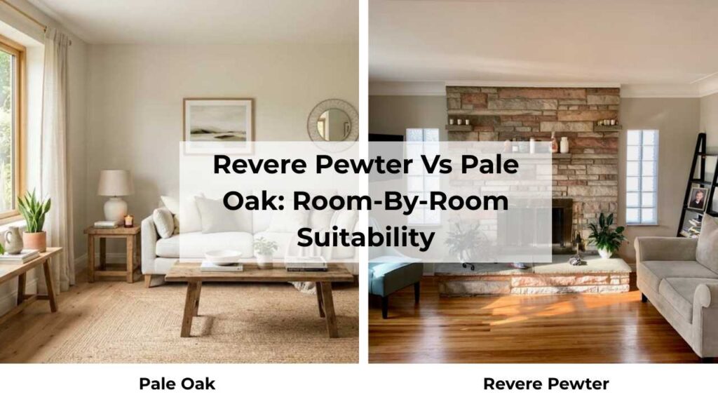
Picking between these two comes down to the specific room conditions like size, light, purpose, and what feeling you’re going for.
I’m going to walk through how each looks in different spaces based on project experience.
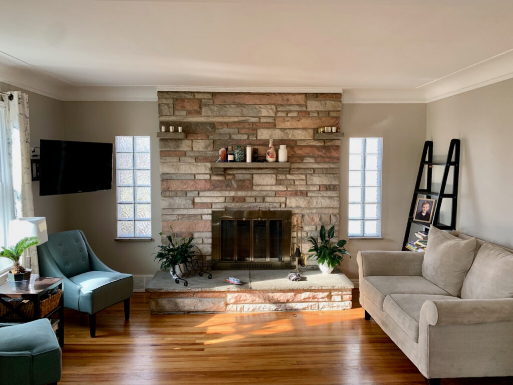
Living Room
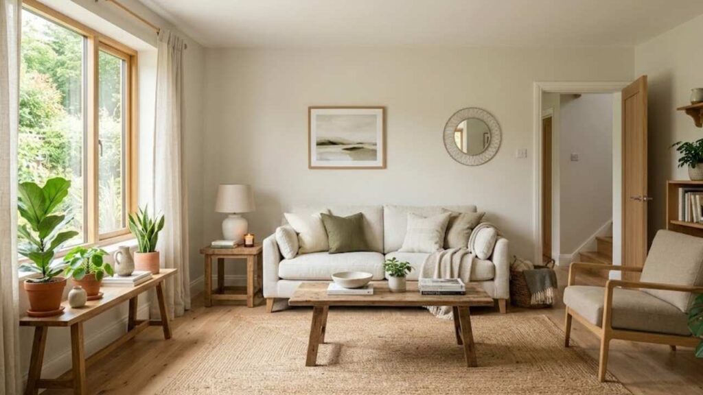
Pale Oak in a living room feels open and welcoming without being harsh.
I used it in a living room that had okay natural light and it made the space feel big.
The warmth kept it from feeling cold or builder-grade, but it wasn’t competing with the furniture or art.
If your living room is small or doesn’t get much light, Pale Oak is safe to go with.
It also works great for open-concept spaces where you want the walls to recede.
Revere Pewter in a living room adds presence and makes the space feel intentionally designed.
I’ve used it in large living rooms with good south or west-facing light and it creates a beautiful, grounded feeling.
The color has depth that provides a backdrop for furniture and décor without disappearing.
BUT if your living room is small or dark, Revere Pewter can make it feel cave-like.
Bedroom
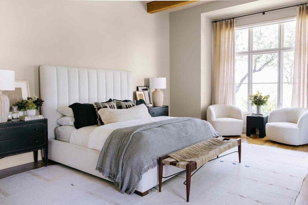
Pale Oak in bedrooms is my go-to for the calm, restful vibe.
The warmth feels cozy without being heavy or closing in.
I painted my own bedroom Pale Oak and I love waking up to it.
It pairs well with white bedding, warm wood furniture, and with any décor style.
If you’re a light-sensitive sleeper who wants darkness, the high LRV may make you consider it more.
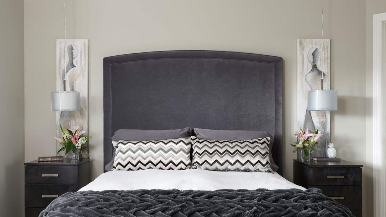
Revere Pewter in bedrooms works if you want a cocoon feel.
Some people love the grounded, wrapped-up feeling for sleep.
I’ve used it in primary bedrooms with good morning light and it feels sophisticated and hotel-like.
But in a small bedroom or one without light, it can feel too heavy.
Bathroom
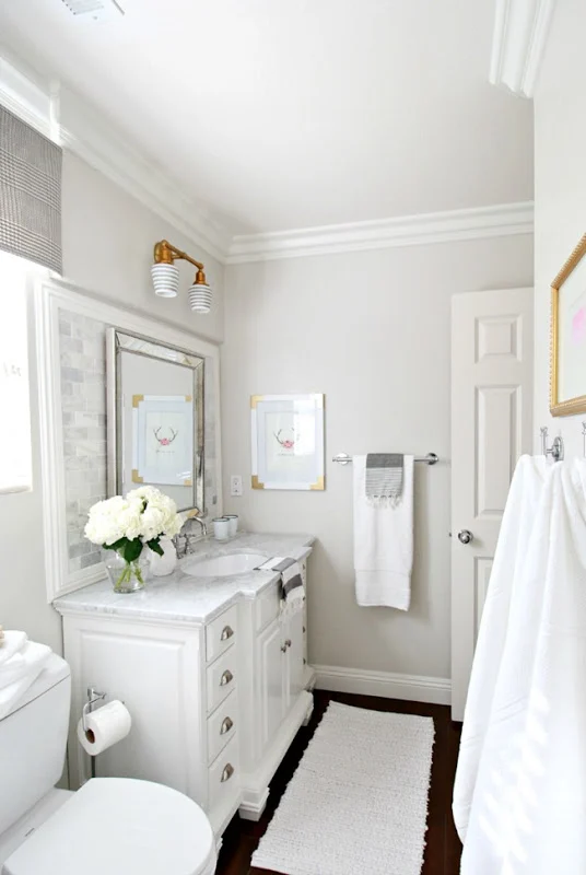
Pale Oak in bathrooms feels spa-like and clean without the cold feeling.
I used it in a bathroom with white subway tile and it was perfect and warm to feel inviting but light to keep the small space feeling open.
It works well in bathrooms without windows or with a small window.
Revere Pewter in bathrooms can be stunning but needs the right conditions.
I used it in a large primary bathroom with a big window and white countertops, and the depth it added was beautiful.
It made the space feel expensive and intentional.
But in a small powder room with limited light it is too heavy.
Kitchen
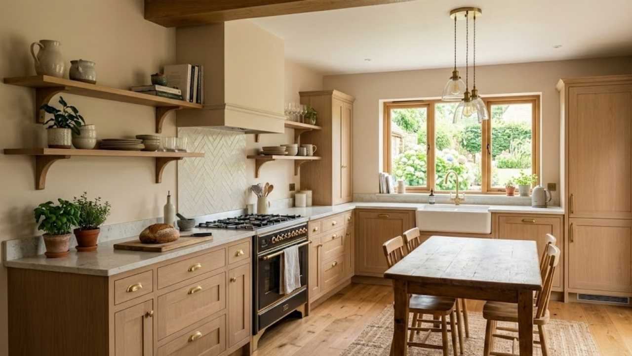
Pale Oak in kitchens works well as a wall color, if you have white or cream cabinets.
It provides warmth to keep the space from feeling cold.
I’ve also seen it used well on cabinets for the soft, light kitchen look that’s popular.
But make sure you’re using a durable finish because kitchens are high-traffic.
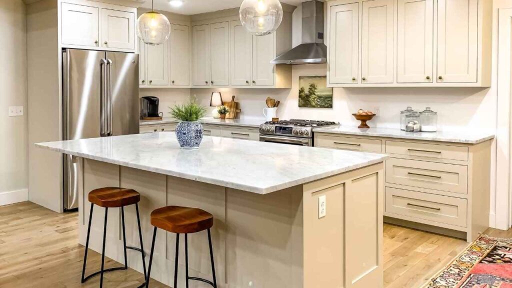
Revere Pewter in kitchens is popular on both walls and cabinets.
As a wall color, it adds depth and makes white cabinets pop without being harsh.
On cabinets, it creates a warm-gray look that pairs well with white subway tile, marble countertops, and brass hardware.
But you CANNOT pair Revere Pewter with cream cabinets because it creates a heavy look, the undertones fight, it looks muddy.
Exterior
Pale Oak on exteriors is fresh and warm without being too light or too yellow.
It works on traditional, craftsman, and transitional style homes.
I love it with bright white trim and a dark door color like Hale Navy or a deep charcoal.
It’s light to feel current but has warmth that doesn’t look off-white siding.
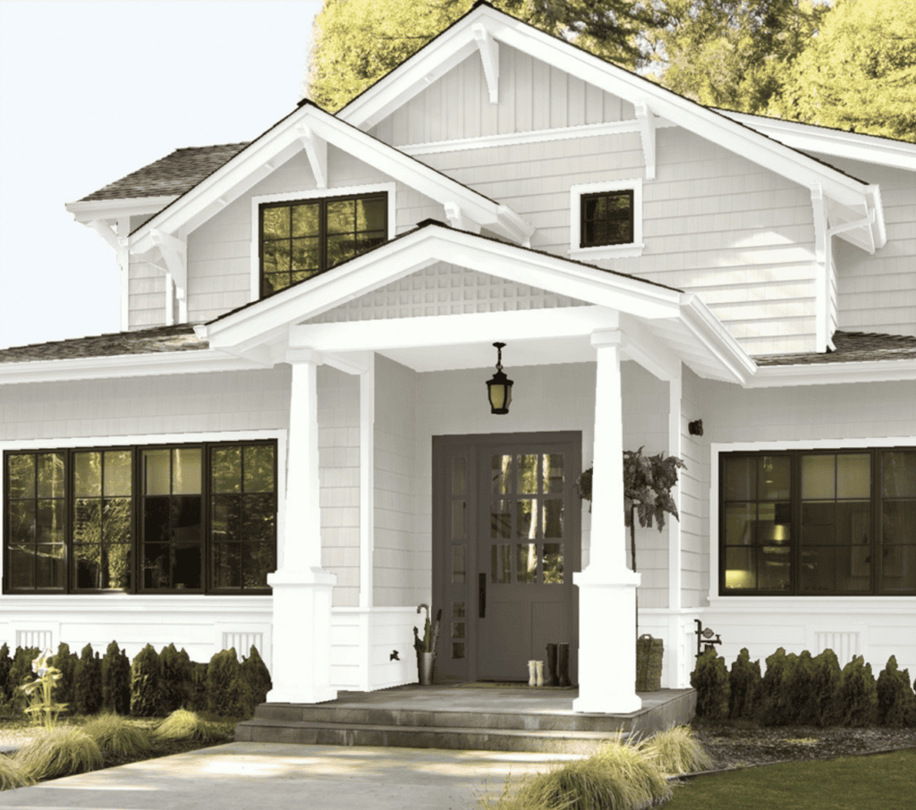
Revere Pewter on exteriors is more popular than on interiors.
It looks beautiful, has dimension, and the medium depth gives homes visual appeal.
The color holds up in direct sunlight without washing out, though it will appear warmer on your exterior than on interior walls.
I’ve seen it on everything from colonials to modern farmhouses, and it works.
Pair it with white trim and a dark door and you’ve got a classic look.
Pale Oak Vs Revere Pewter Vs Other Colors
You’re probably wondering how these look against other popular neutrals, because let’s be real, there are many greige options out there.
Here’s how Pale Oak Vs Revere Pewter compares to the other same colors.
Pale Oak Vs Edgecomb Gray
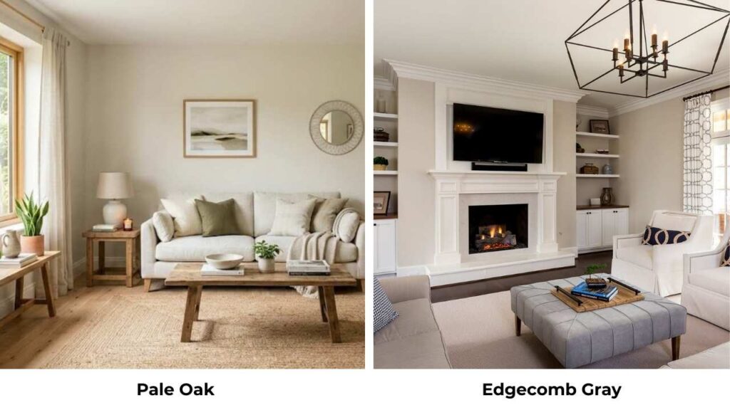
Edgecomb Gray is another Benjamin Moore favorite that people look at with Pale Oak.
Edgecomb has an LRV around 63, making it darker than Pale Oak but in the light family.
The big difference is warmth, Edgecomb Gray is more yellow-beige while Pale Oak stays in the taupe-pink zone.
Edgecomb can look peachy or yellow in warm light. Pale Oak is neutral-warm without the yellow.
Pale Oak Vs Seapearl
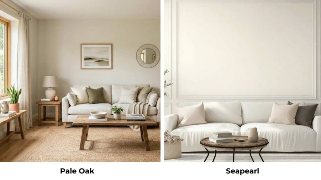
I’m assuming this is Sea Pearl by Benjamin Moore, which is soft neutral.
Sea Pearl has a cooler undertone than Pale Oak and can look more gray in some lights.
Pale Oak maintains consistent warmth. If you have cool-toned finishes, Sea Pearl may work better.
Pale Oak Vs White Dove
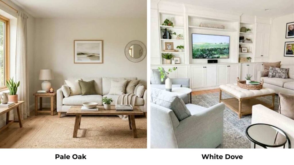
White Dove is a white, not a greige, with an LRV around 83.
It’s visibly lighter and fresher than Pale Oak.
White Dove is what I recommend for trim when using Pale Oak on walls, it provides contrast without being harsh.
But as wall colors, they serve different purposes.
White Dove when you want white with warmth, Pale Oak when you want color looks as almost-white.
Pale Oak Vs City Loft
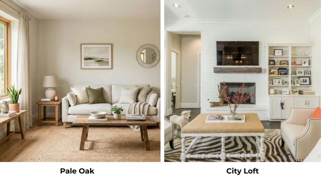
City Loft is a Sherwin Williams color that’s a warm gray with pink-violet undertones, similar to Pale Oak in terms of undertone direction.
City Loft has a lower LRV making it a touch darker.
If you’re locked into Sherwin Williams for some reason, City Loft is a decent alternative.
Pale Oak Vs Revere Pewter Vs Accessible Gray
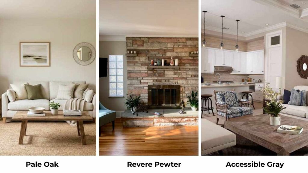
Accessible Gray is Sherwin Williams’ answer to Revere Pewter.
It has an LRV around 57, making it similar in depth to Revere Pewter but lighter.
Accessible Gray is known for flexing between green and violet undertones depending on lighting.
Pale Oak is lighter than both and stays in the warm-taupe zone.
Pale Oak is light and warm. Revere Pewter is medium with green undertones. Accessible Gray is medium with flexible undertones.
They’re three different colors for three different purposes.
Revere Pewter Vs Edgecomb Gray
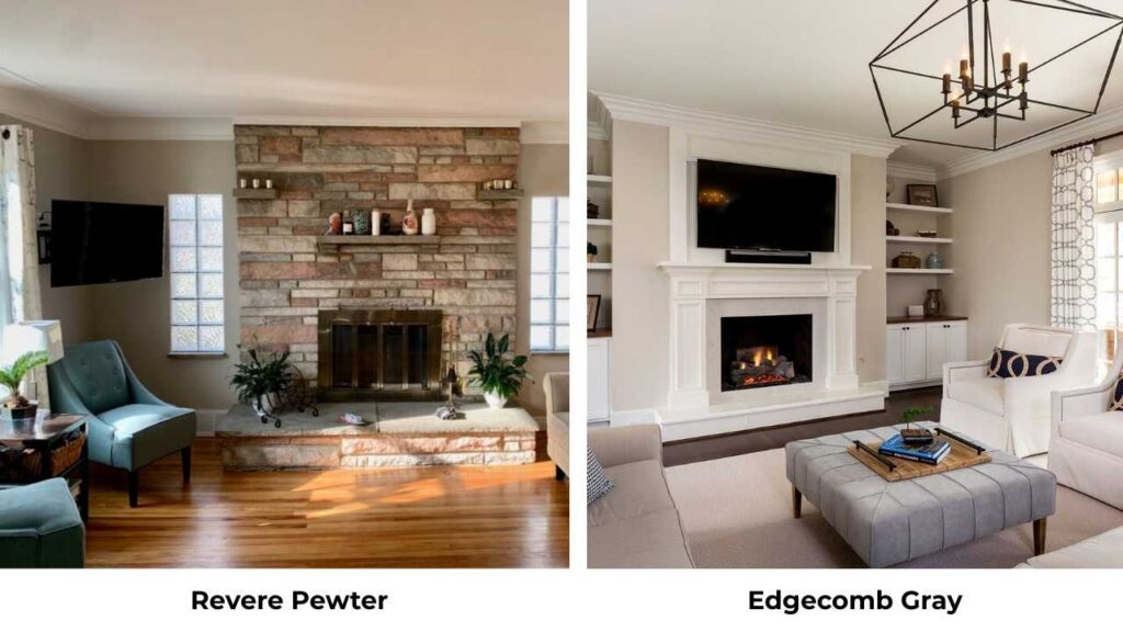
Edgecomb Gray is lighter and warmer-yellow compared to Revere Pewter’s green undertones.
Edgecomb is beige, Revere Pewter is more gray.
If Revere Pewter feels too heavy for your space but you like the idea, Edgecomb Gray is a lighter alternative.
Just know the undertones are different animals.
| Paint Color (Brand) | LRV (Approx.) | Undertone Profile | Warmth Level | Best Used In |
| Pale Oak (Benjamin Moore) | 69 | Soft taupe with pink-violet undertones | Warm-neutral | Light, airy spaces; homes wanting “almost white” warmth |
| Revere Pewter (Benjamin Moore) | 55 | Greige with noticeable green undertones | Warm | Medium-depth spaces, traditional interiors |
| Edgecomb Gray (Benjamin Moore) | 63 | Beige with yellow undertones | Warm | Spaces where Revere Pewter feels too heavy |
| Sea Pearl / Seapearl (Benjamin Moore) | 76 | Soft gray with cooler undertones | Cool-neutral | Homes with cool-toned finishes or modern palettes |
| White Dove (Benjamin Moore) | 83 | Warm white with subtle gray | Warm | Trim, cabinetry, or walls when a true warm white is needed |
| City Loft (Sherwin Williams) | 62 | Warm gray with pink-violet undertones | Warm | Sherwin Williams alternative to Pale Oak |
| Accessible Gray (Sherwin Williams) | 57 | Greige with flexible green–violet undertones | Warm-neutral | Similar depth alternative to Revere Pewter |
Which One To Choose Between Pale Oak Vs Revere Pewter?
The answer isn’t which one is “better” butit’s which one is better for your specific space and what you want to feel in that space.
Choose Pale Oak when:
- Your room is small or has limited natural light
- You want brightness and airiness maintained
- You’re looking for a whole-house neutral that’s forgiving
- You have north-facing rooms that need warmth without going dark
- You want a soft, calm, light backdrop that doesn’t compete with décor
- Your finishes have cool or pink undertones
- You want minimal contrast with white trim
Choose Revere Pewter when:
- Your room is large with good natural light
- You want depth and presence, not just a backdrop
- You want a color that feels intentional and grounding
- Your finishes are natural stone, warm woods, or earth-toned
- You’re okay with that green undertone
- You want contrast and definition in your space
- You’re using it on exteriors where it will get full sun
If you’re unsure, Pale Oak is safe. It’s forgiving, works in many conditions, and rarely looks bad.
Revere Pewter is beautiful when it’s right but can be difficult when conditions aren’t according to it.
Conclusion
Pale Oak Vs Revere Pewter are both fantastic Benjamin Moore greiges, but they’re serving different purposes and working in different conditions.
Pale Oak is light, warm, forgiving neutral that brightens spaces while maintaining warmth.
Revere Pewter is grounded, present, statement greige that adds depth and intention.
The undertones matter, the taupe-pink in Pale Oak versus green in Revere Pewter changes everything about how these colors coordinate with your existing finishes and lighting.
And the 14-point LRV difference is the difference between airy and substantial, between a space that feels large and one that feels defined.
So, go with your space’s lighting conditions more than anything. Test your samples.
And when in doubt, go with the light one, it’s easier to add depth with décor and furniture than it is to brighten a too-dark color.
FAQs On Pale Oak Vs Revere Pewter
No, Pale Oak has taupe undertones with pink-violet influences, while Revere Pewter has green undertones. These undertones go against each other and create an awkward clash rather than a cohesive. If you want to use two different neutrals in connecting spaces, pick ones with similar undertones.
Revere Pewter is balanced between gray and beige, which is why it’s called a greige. In lighting it looks as a warm gray with a beige softness. The green undertone leans it more toward gray, but it never feels cool.
Edgecomb Gray from Benjamin Moore is light but similar in concept. Agreeable Gray from Sherwin Williams is the closest from a different brand like similar depth, warm greige, but Agreeable Gray flexes between green and violet undertones depending on light. Colonnade Gray from Sherwin Williams is another option with less green undertone.
Don’t use Revere Pewter in small, dark rooms with limited natural light, it will look muddy and make the space feel small. Don’t pair it with cream or beige cabinets, the undertones clash and it looks heavy. Avoid it in north-facing rooms without good supplemental lighting. Don’t use it if your existing finishes have pink or purple undertones.
Don’t use Pale Oak if you want color presence and depth on your walls because it’s too light for that. Avoid it if your trim is harsh white or cool white because it won’t provide contrast and everything will blend together. Don’t pair it with yellowy finishes because the pink undertone can clash.