Sherwin Williams Rainwashed Vs Sea Salt, Both colors look identical on the little swatches.
They’re both airy, calming, blue-green neutrals that turn your bedroom into a spa retreat or your bathroom into a coastal escape.
But the small undertone differences can change how a room feels.
One can make your space look fresh and beachy, the other could leave you wondering why your walls look gray.
These two colors get compared, and for good reason.
They both deliver a soft, spa-like appearance that works well in bedrooms, bathrooms, living rooms, and with any coastal-inspired interior.
But picking the wrong color can make your planned room feel cold, or muddy.
So here I’m breaking down the color profiles of Sherwin Williams Rainwashed vs Sea Salt.
We’ll get into LRV, undertones, how lighting affect both of them, and which rooms they work in.
I’m also putting in a comparison table because sometimes you need to see it side-by-side.
Here are my other blog posts that you can also read:
- Clary Sage Vs Evergreen Fog
- City Loft Vs Alabaster
- Onyx Color Vs Black
- Eider White Vs Alabaster
- Manchester Tan Vs Accessible Beige
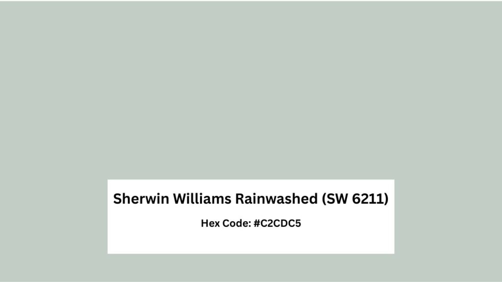
Color Profile of Sherwin Williams Rainwashed (SW 6211)
Rainwashed is colorful. It’s a light blue-green paint color with visible blue influence, you can see the color when it’s on the wall, which sounds obvious but some of these “blue-greens”.
The thing about Rainwashed is it is fresh and clean, more than Sea Salt.
It’s described as a cool, fresh blue-green.
The aqua-leaning quality is what makes it popular for modern, transitional, and contemporary interiors. It’s not trying to fade into the background.
Depending on your lighting, Rainwashed can lean aqua or shift toward a soft blue but it looks gray, which is different from Sea Salt.
In bright southern light, it gets a gorgeous beachy, breezy quality.
Morning light makes it look turquoise-ish.
Evening light calms it down to a soft blue.
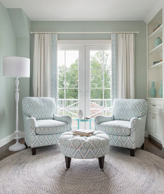
Homeowners and designers keep coming back to this color for living rooms where they want some color without committing to something bold.
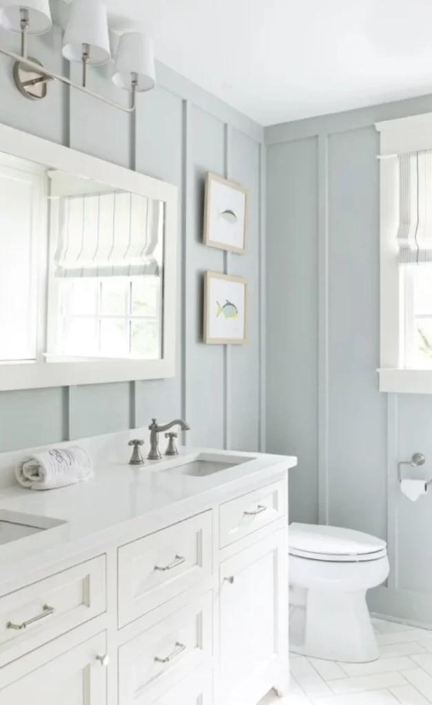
Bathrooms are huge for Rainwashed because it has that spa feeling but with personality.
Bedrooms work too, if you’re going for coastal vibes or want something calming that isn’t beige.
The LRV is around 59-60, making it darker than Sea Salt.
It holds its color better in dim lighting, which is why I prefer it for the north-facing rooms.
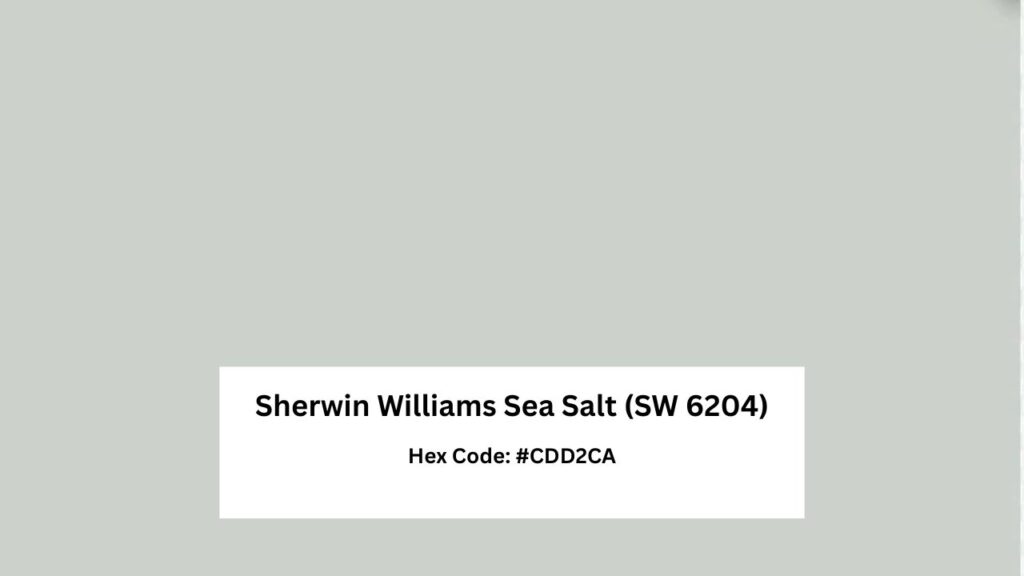
Color Profile of Sherwin Williams Sea Salt (SW 6204)
Sea Salt is the chameleon. It’s a soft green-gray paint color with subtle blue undertones.
This color is more muted and neutral compared to Rainwashed.
Some days it will look green. Other days it’s gray.
The shifting quality between green, gray, and blue depends on surroundings. It’s known for the calm, spa-like, relaxed feel.
I’ve used Sea Salt in open-concept spaces where it needed to flow from room to room without making a statement, and it performs beautifully.
The gray in Sea Salt softens everything and increases the neutrality.
It’s easier to live with long-term because it doesn’t demand attention.
You can pair it with warm woods, cool metals, white cabinets, gray countertops.
In some lights, mainly cool north-facing light, it can read as straight-up gray.
It is popular in modern farmhouse, transitional, and Scandinavian-style interiors, Sea Salt works in living rooms, bedrooms, kitchens, bathrooms, and hallways.
The LRV is around 63, so it reflects more light than Rainwashed and appears light.
What is the Difference Between Sherwin Williams Rainwashed and Sea Salt?
Okay, so they’re both blue and green, both calm and spa-like, both from Sherwin Williams. Cool.
But the differences matter when you’re staring at your painted walls wondering why it doesn’t look like the photo.
The undertones, LRV, and in different lighting conditions create different results.
Let me break this down in ways that matter when you’re trying to decide.
LRV
Light Reflectance Value is how much light a color reflects back, rated from 0 (pure black) to 100 (pure white).
It’s not about light vs. dark and it affects how colors behave in your space with your lighting.
Sea Salt has an LRV of about 63 which puts it in the medium-light range.
It reflects a good amount of light, which is why it feels airy and open in spaces.
In bright rooms with natural light, it’ll feel lighter.
BUT in shadowy areas or rooms with minimal windows, that LRV means it can lose some of its color.
Rainwashed is an LRV around 59-60. The lower LRV means it holds onto its color better in low light situations.
I prefer this for north-facing spaces because it doesn’t fade into nothingness.
The color stays, which is what you want when you’ve made the commitment.
The four-point LRV difference may not sound like much, but I’ve seen it change how two nearly-identical colors read in the same room.
Sea Salt will feel light and expansive.
Rainwashed will feel rich and intentional.
Undertones
Sea Salt’s primary undertone is green, with secondary undertones of blue and gray.
The gray content is heavy ], it softens everything and pulls the color toward neutral territory.
In warm light, you’ll see more of the green. In cool light, it shifts toward blue-gray.
I had a project where Sea Salt looked perfect in the showroom.
Got it on the client’s walls in their north-facing living room and it looked like a sad hospital hallway gray.
We had to pivot to warm accents and change the lighting temperature to bring back the green-blue.
Rainwashed’s primary undertone is blue, with green as secondary.
Less gray means it’s more saturated and maintains a color presence.
It is gray but the blue is too strong for that.
Even in low light, you’ll still see the color.
Lighting Behaviour
Sea Salt in different lighting:
- Bright south-facing rooms: Can look washed out, light
- North-facing rooms: Skews gray-blue, can feel cold
- East-facing rooms: Morning light brings out the green, afternoon it goes more gray
- West-facing rooms: Warm afternoon light pulls out green tones, can look pretty
- Artificial warm lighting: Brings out green-gray
- Artificial cool lighting: More blue-gray, can feel sterile
Rainwashed in different lighting:
- Bright south-facing rooms: Looks bright and beachy, aqua-leaning, stays colorful
- North-facing rooms: Maintains color better than Sea Salt, readable as blue-green
- East-facing rooms: Gorgeous in morning light, softens by afternoon
- West-facing rooms: Stays fresh throughout the day, warm evening light doesn’t muddy it
- Artificial warm lighting: Softens slightly but maintains blue presence
- Artificial cool lighting: Enhances the crisp, fresh quality
Styling and Best Uses
Trim, ceiling color, furniture choices, and accent pairings will affect how these colors will look in your space.
For Sea Salt:
- Trim: Bright whites like Pure White or Extra White create clean contrast. Warm whites like Alabaster add softness and enhance the spa feeling.
- Ceilings: White is standard, but you could go with Sea Salt for a subtle enveloping effect
- Furniture: Light oak, medium warm woods, white upholstery, soft grays
- Countertops: White quartz, marble, light gray stone
- Accents: Warm metallics, soft blues, greens, and whites, natural textures
For Rainwashed:
- Trim: Bright whites for maximum contrast and fresh coastal feel
- Ceilings: Keep it white to let the wall color be the statement
- Furniture: Light natural woods, white or cream upholstery, avoid competing colors
- Countertops: White or pale gray
- Accents: Chrome, brushed nickel, whites, soft corals or blush pinks, natural fibers
| Feature | Sea Salt | Rainwashed |
| Color Code | SW 6204 | SW 6211 |
| LRV | ~63 | ~59-60 |
| Primary Undertone | Green | Blue |
| Secondary Undertones | Blue and Gray | Green |
| Gray Content | Higher | Lower |
| Saturation Level | Muted, neutral-leaning | More colorful, saturated |
| Color Shift | Green/Gray/Blue depending on light | Aqua/Blue/Blue-green, stays truer |
| Best Lighting | Bright, south/west-facing | North-facing, lower light |
| Visual Temperature | Cool-leaning but balanced | Cool |
| Best Use | Whole-home color, multiple rooms | Feature rooms, bathrooms, bedrooms |
| Style Compatibility | Modern farmhouse, transitional, Scandinavian | Coastal, cottage, casual fresh spaces |
| Trim Pairing | Pure White, Extra White, Alabaster | Oxford White, High Reflective White |
Sherwin Williams Rainwashed Vs Sea Salt: How Do They Look In Different Rooms
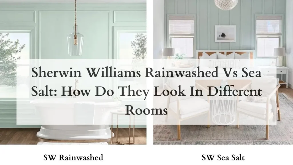
The room matters. I’ve seen both of these colors look different depending on whether they’re in a bathroom or in a living room and it’s not about light, it’s about the purpose of the space and what surrounds the color.
Let me walk you through the common applications and what happens.
Living Room
Rainwashed in the living room makes a statement.
It works best if you want your wall color to be part of the design conversation.
I used it in a transitional living room that had southern and western windows and it looked fresh.
Morning light gave it a bright aqua quality, afternoon light settled it into a calm blue-green.
The thing is, Rainwashed needs some breathing room in a living room.
If you’ve got competing colors or busy patterns, it will feel like too much.
It works better in spaces leaning toward minimalist or coastal styles.
Sea Salt in the living room is safe for most people.
It creates a calm, neutral backdrop that doesn’t demand anything from you.
I’ve specified it for open-concept spaces where the living room flows into the kitchen and dining area, Sea Salt makes that transition feel seamless.
It pairs well with any furniture style.
In living rooms with limited natural light, Sea Salt can feel flat.
One north-facing living room I worked on ended up looking like gray until we added warm-toned accents and changed to warm light bulbs.
Bedroom
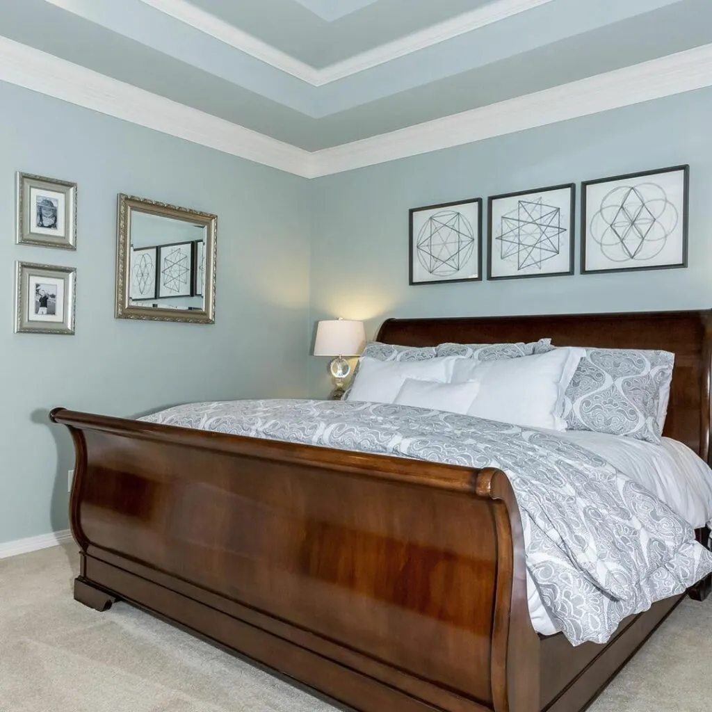
Rainwashed in the bedroom creates a fresh, airy oasis feeling.
If you want to wake up feeling like you’re in a beach house, this is your color.
I recommended it for a master bedroom with eastern windows.
By evening, it showed up as a soft blue.
One thing to remember, if you’re someone who finds blue energizing rather than calming, Rainwashed can be too awake for a sleep space.
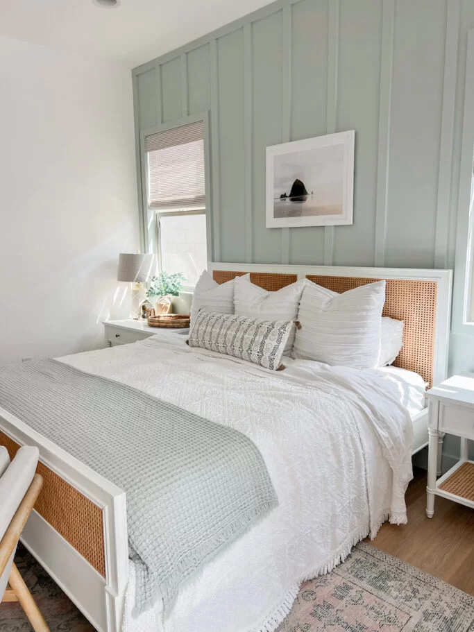
Sea Salt in the bedroom is foolproof for creating a calm, restful environment.
The muted quality works well when you want color without stimulation.
I’ve used it in multiple master bedrooms paired with white bedding, warm wood furniture, and soft textiles.
It also photographs well, which matters if you care about that sort of thing.
Bathroom
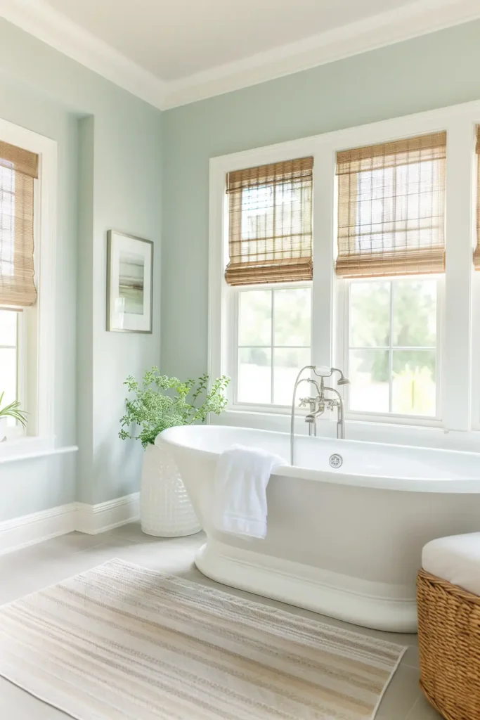
Bathrooms are where both of these colors shine.
Something about the spa-like quality works in small, humid spaces.
Rainwashed in the bathroom delivers on the coastal spa.
I’ve used it in several bathrooms, paired with white subway tile, marble countertops, and chrome or brushed nickel fixtures.
The color stays present in windowless bathrooms with only artificial light.
In bathrooms with windows, it can look tropical in a good way.
Sea Salt in the bathroom is classic for a reason.
It creates a soft, soothing environment that feels spa-like without being colorful.
I’ve specified it for bathrooms with white cabinets and it works.
It pairs well with both warm and cool metals, which gives you flexibility.
Kitchen
Kitchens are tricky because you’ve got cabinets, countertops, backsplashes, and flooring all competing for attention.
Rainwashed in the kitchen works if you’ve got white or light cabinets and want to add some personality to the walls.
I’ve seen it look beautiful in kitchens with white shaker cabinets, white subway tile backsplash, and light countertops.
It adds a fresh, clean feeling without overwhelming the space.
Sea Salt in the kitchen is versatile because of the neutral quality.
It works with white cabinets but it handles light wood tones better than Rainwashed.
I specified it for a kitchen with light oak cabinets and it looked good, the green-gray undertone complemented the wood.
It’s also easy to coordinate with various countertop materials.
Sherwin Williams Rainwashed Vs Sea Salt Vs Other Colors
Sometimes you need context to understand what you’re looking at.
Comparing these colors to similar options helps clarify what makes each one unique.
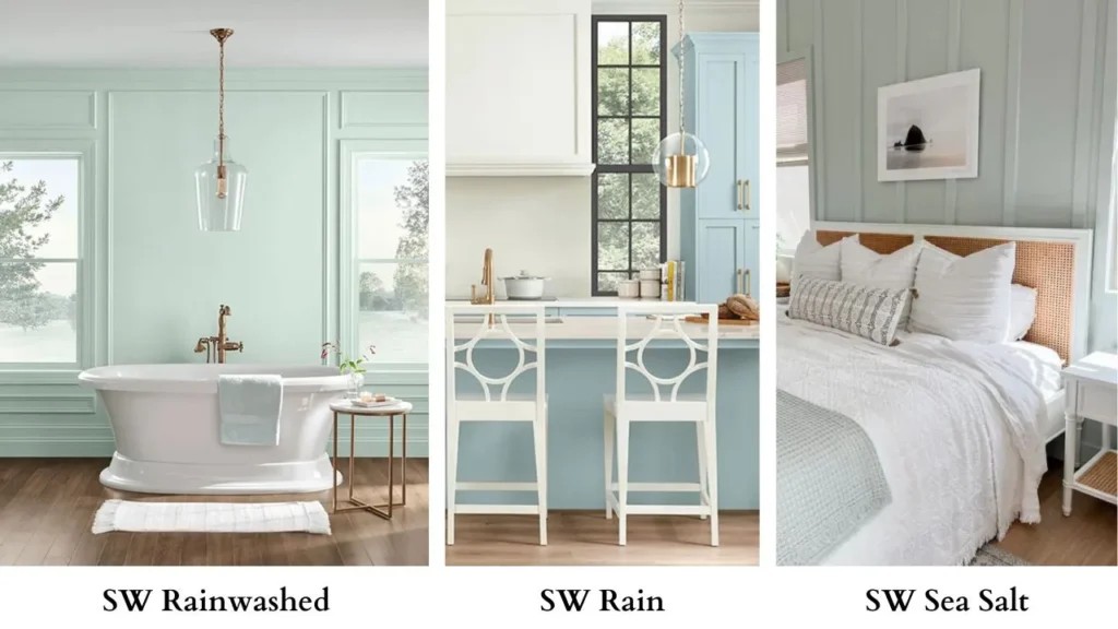
Sherwin Williams Rain vs Rainwashed
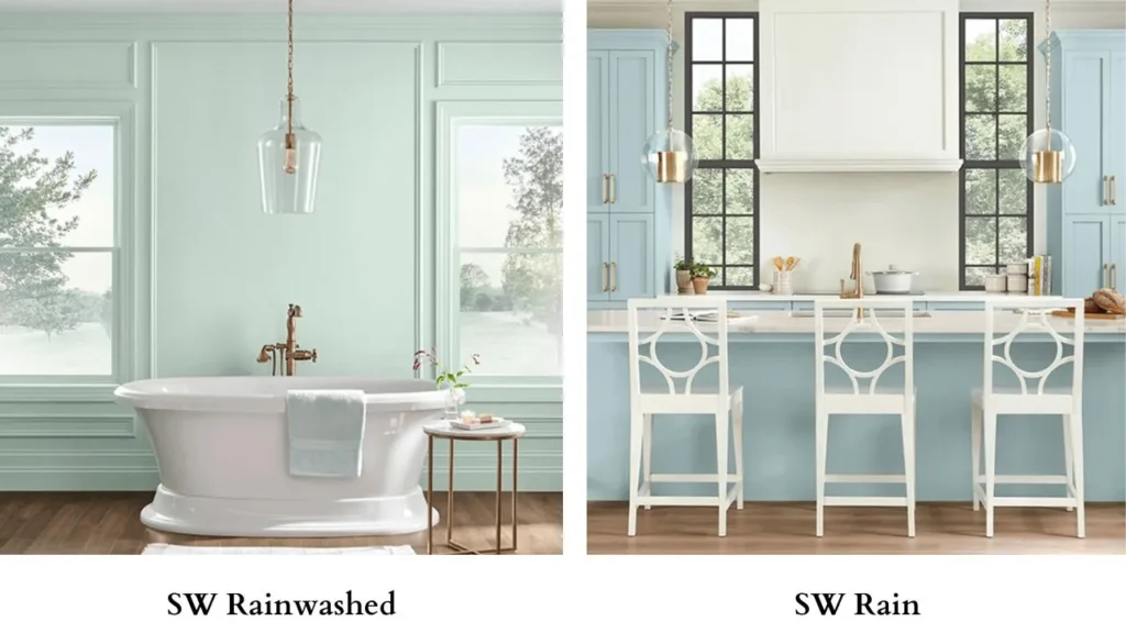
I get asked about this constantly. SW Rain is different.
It’s more gray with blue undertones, less green than Rainwashed.
Rain is at a similar LRV but is much more neutral, almost like a blue-gray rather than a blue-green.
If you’re deciding between them, Rain is the choice if you want something more muted and subtle than Sea Salt.
Rainwashed Vs Quietude
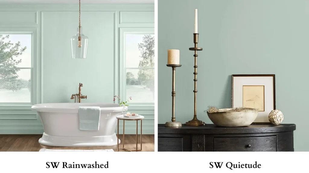
SW Quietude is another soft blue-green that gets compared to Rainwashed.
Quietude leans more green and is light.
It’s similar, but sometimes I think they’re identical in some lighting.
The difference is subtle so I’d recommend sampling both.
Quietude may look as marginally soft and less saturated.
Rain Vs Sea Salt
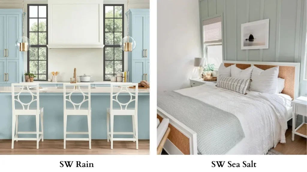
Rain vs Sea Salt is comparing a blue-gray to a green-gray-blue.
Rain has more gray, less green, and a cooler appearance.
Sea Salt brings more color to the table with the green and blue undertones.
If you want maximum neutrality with a hint of cool tone, go Rain.
Can Sherwin Williams Sea Salt Paint Be Lightened?
Here’s the thing, you can lighten any paint color by having it mixed at 75% or 50% strength.
But when you lighten Sea Salt, you’re diluting the subtle undertones.
It’ll become a pale, barely-there color that looks off-white in lighting conditions.
If Sea Salt feels too dark or saturated for your space, I’d recommend looking at SW Opaline instead.
Opaline has an LRV of 72, lighter than Sea Salt’s 63, but it maintains more color integrity than a lightened version of Sea Salt.
Another option is Benjamin Moore Gray Mist if you want something lighter in the gray-green family, or SW Silverpointe which offers a muted, gray-dominant alternative while keeping blue-green undertones.
Sherwin Williams Rainwashed Color Palette
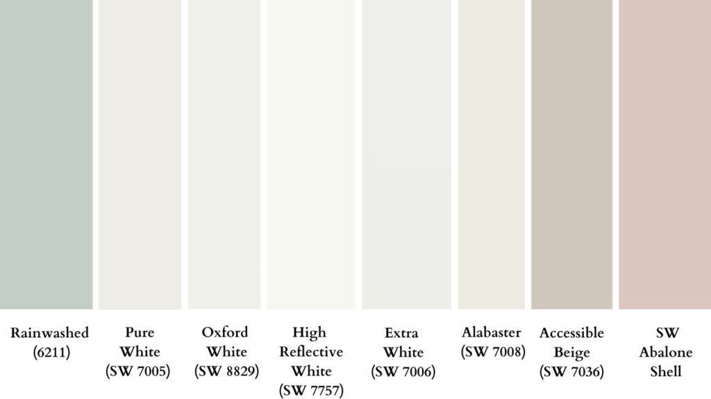
If you’re going with Rainwashed, here are colors that pair well with it based on projects, not just theory:
- Pure White (SW 7005) – bright white for trim and ceilings
- Oxford White (SW 8829) – another great true white option for maximum contrast
- High Reflective White (SW 7757) – if you want bright, clean white
- Extra White (SW 7006) – cooler white that complements the blue undertones
- Alabaster (SW 7008) – if you want a softer white
- Accessible Beige (SW 7036) – warm neutral for accent walls or adjacent rooms
- Soft corals or blush pinks – think SW Abalone Shell for accent pieces
- Navy blues – for accent pillows or artwork
- Natural wood tones – light to medium, avoid warm honey tones
- Whites and creams – for furniture and textiles
- Chrome, brushed nickel, polished nickel – for fixtures and hardware
Conclusion
Look, choosing between Sherwin Williams Rainwashed Vs Sea Salt comes down to what you want to live with.
Sea Salt is the easy, neutral choice that works in situations with less risk.
It’s the color you pick when you want color to move beyond boring neutrals.
Rainwashed is for when you want to see color on your walls, when you want fresh, beachy, and identifiable blue-green that doesn’t disappear in different lighting.
I’ve specified both many times, and they’re both great colors.
But they’re great for different reasons and different spaces.
Sea Salt is your home, plays-well-with-everything, works-in-most-lighting option.
Rainwashed is your statement-making, personality-adding, colorful choice.
Test them both. Watch them throughout the day.
Trust your once you’ve done the work to understand how they’ll behave in your space.
Comparing Sherwin Williams Rainwashed Vs Sea Salt can be a bit confusing and difficult but clearing it can help you a lot.
FAQs on Sherwin Williams Rainwashed Vs Sea Salt
Sea Salt is a soft green-gray paint color with subtle blue undertones. It shifts between appearing green, gray, or blue depending on lighting and surroundings. It’s cool-leaning but balanced, muted and neutral.
Sea Salt pairs well with bright whites (Pure White, Extra White), warm whites (Alabaster), light to medium wood tones, white quartz or marble countertops, soft blues and greens, warm metallics like brass and gold, and natural textures. It’s flexible with most neutrals.
Sea Salt is cool-leaning due to its blue and green undertones, but it’s more balanced than many cool colors. It doesn’t have warm beige or yellow undertones, so it stays in the cool category.
Rainwashed is a cool color. The dominant blue undertone with secondary green makes it cool-toned. It pairs best with cool whites, chrome fixtures, and doesn’t work well with warm wood tones or warm metallics.