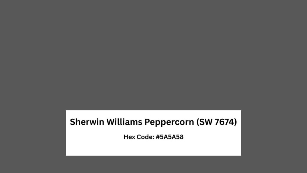
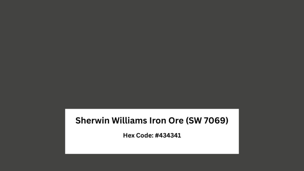
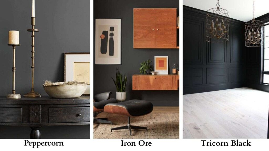
Sherwin Williams Peppercorn (SW 7674) and Iron Ore (SW 7069) are the two most compared dark gray paints.
There’s been a massive shift toward deep charcoal and near-black paint colors in modern and transitional interiors. People are tired of the greige walls.
When clients are debating Peppercorn vs Iron Ore, they’re trying to get the moody, sophisticated vibe.
Both of these colors get mistaken for black. They’re what I call “soft blacks” or dark grays that is almost-black depending on your lighting.
Iron Ore has an LRV of 6, while Peppercorn is at LRV 10.
But the small difference changes how they look in space.
Iron Ore is close to black with cool undertones that can flash blue or green.
Peppercorn is more of a chameleon, a deep gray that can be warm brown, cool blue, or green undertones.
Here, I’m breaking down Peppercorn Vs Iron Ore, how they look in real life.
Then a side-by-side comparison looking at LRV, undertones, lighting behavior, and styling. After this, we’ll go room-by-room.
And then, I’ll compare both of these to other dark colors.
Here are my other blog posts that you can also read
- Tricorn Black Vs Iron Ore
- Wrought Iron Vs Iron Ore
- Eider White vs Alabaster
- Tricorn Black Vs Black Magic
- Balanced Beige Vs Accessible Beige
Sherwin Williams Peppercorn Color Breakdown (SW 7674)
Peppercorn is tricky.
On the paint swatch, it looks like a dark gray but on the wall it can look brown or green or blue.
RGB values of 90, 90, 88 and hex code #5A5A58.
The RGB reading proves it’s a neutral gray and the red, green, and blue values are identical.
But here’s where paint gets weird and why I love it.
Despite the neutral numbers, Peppercorn has subtle brown and taupe undertones that come in some lighting.
I’ve used Peppercorn many times. It is warm and earthy.
There’s an organic quality to it, not rustic, but grounded. It doesn’t have a heavy, dramatic look. It’s sophisticated without being intense.
Peppercorn works well in modern, transitional, and contemporary spaces in both interiors and exteriors.
I’ve painted living rooms, used it on accent walls in bedrooms, and on kitchen islands.
The color has a softness that makes it approachable.
For exteriors, Peppercorn on siding creates an understated elegance.
Pair it with a white like Snowbound for trim and it creates a classic modern farmhouse look.
But in the sun, the blue undertone can show up.
The warm-to-cool split on this color is 50-50. Some rooms will be warm and cozy.
Others can be cool and contemporary.
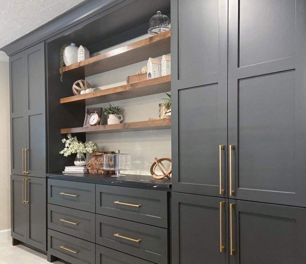
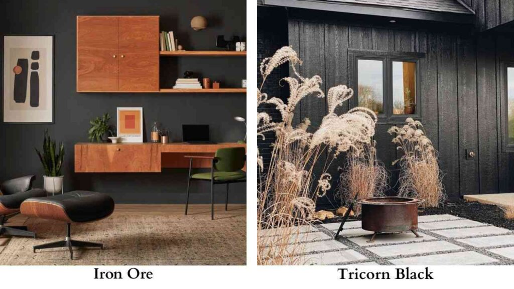
Sherwin Williams Iron Ore Color Breakdown (SW 7069)
Iron Ore doesn’t mess around. This is a very dark charcoal that is close to black.
RGB 67, 67, 65, hex #434341, and the LRV of 6-7.
For reference, black has an LRV of 0, and white is 100. So yeah. Iron Ore is dark and much darker than Peppercorn.
The undertones are cool, mainly blue and green depending on the lighting.
I’ve seen it in some natural light, which sounds weird for a charcoal gray, but paint is like that. The color lives in the yellow family according to Sherwin Williams.
It presents as a cool-toned dark gray in every real-life application.
Iron Ore is heavy. It’s moody and dramatic.
When you want contrast against white walls or trim, consider this color.
I love it for interior doors, fireplace surrounds, and kitchen islands.
For modern, industrial, and contemporary spaces, Iron Ore is the best choice.
It has an architectural quality that makes it feel intentional and designed.
On exteriors, it creates a visual appeal. But it absorbs more heat than light colors.
The blue undertone can be startling.
I always tell clients to test it in their space because what can look like charcoal indoors can look blue-ish on an exterior in daylight.
Peppercorn Vs Iron Ore: Side-By-Side Comparison
Alright, let’s put Peppercorn Vs Iron Ore next to each other because the differences matter more than we think or consider and for colors that are both “dark gray.”
LRV (Light Reflectance Value)
Iron Ore’s LRV of 6-7 vs Peppercorn’s LRV of 10 quantifies why one feels near-black and the other feels like charcoal.
Light Reflectance Value is on a 0-100 scale and zero being absolute black that reflects no light, 100 being pure white that reflects all of it.
Anything under 10 is considered a dark color that’ll absorb light in a room.
The 3 to 4 point difference is visible when you put samples side-by-side.
Peppercorn has enough lightness that it doesn’t have the almost-black look. Iron Ore crosses it.
For practical purposes, this affects how much your room lighting matters.
The lower the LRV, the more important your natural lighting and artificial lighting setup becomes.
Undertones
Iron Ore: Cool undertones with blue and occasional green or olive hints.
You’re not going to see warm brown tones show up.
The blue can be subtle or depending on what time of day it is and what colors are reflecting onto it.
Peppercorn: Neutral base with chameleon tendencies.
It can show warm gray, brown, blue, OR green undertones depending on everything else in the room.
Your flooring, your furniture, your lighting, time of day, which direction the room faces.
The RGB of 88, 88, 88 proves Peppercorn is pure gray.
But it manages to reflect its surroundings.
I had a client once who told Peppercorn looked purple in her north-facing bedroom, but it had a mauveish rug and the color was bouncing.
Lighting Affect
Iron Ore in different lighting:
- Low light or evening: Goes almost black. Undertones disappear. Just reads as dark.
- Bright natural light: That’s when the blue or green undertone wakes up. The depth softens but it’s very dark.
- Warm artificial lighting: Feels heavy and moody. Can make a room feel smaller if you don’t have light sources.
Peppercorn in different lighting:
- Low light: Stays visible as dark gray, not black. You can read it as gray.
- Bright natural light: Maintains its gray appearance consistently. Whatever undertone is going to show up will show up here.
- Artificial lighting: More forgiving than Iron Ore. Doesn’t shift dramatically.
If you have a room with limited natural lighting, Peppercorn is the safe choice. Iron Ore in a dim room can feel oppressive.
Style and Best Uses
Both work in modern, transitional, and contemporary settings, but they give you different purposes.
Iron Ore excels at:
- Creating maximum contrast
- Exterior siding for bold modern looks
- Accent walls where you want drama
- Fireplace surrounds
- Kitchen islands against white cabinets
- Any application where “almost black” is the goal
Peppercorn excels at:
- Full interior walls where you want depth but not darkness
- Bedrooms and living rooms for sophisticated but livable spaces
- Exteriors where you want elevated neutral
- Kitchen islands where contrast is wanted but softer
- Trim when you want between white and black
| Aspect | Peppercorn (SW 7674) | Iron Ore (SW 7069) |
| LRV | 10 | 6-7 |
| Darkness | True deep gray | Near-black charcoal |
| Undertones | Neutral/chameleon | Cool |
| Warmth | Can read warm or cool | Consistently cool |
| Drama Level | Sophisticated, approachable | Bold, moody, high-impact |
| Contrast | Medium-soft | Very strong |
| Best For | Full walls, livable spaces, versatile applications | Accent walls, doors, exteriors, statement pieces |
| Lighting Sensitivity | Moderate, shows different undertones | High, can look almost black in low light |
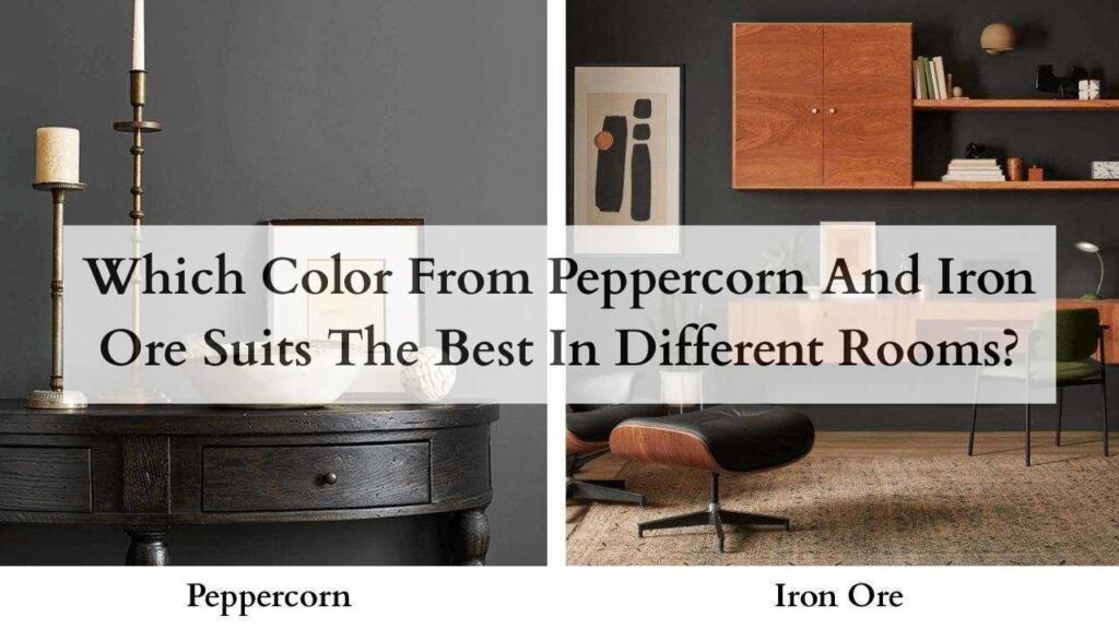
Which Color From Peppercorn And Iron Ore Suits The Best In Different Rooms?
Choosing between these two isn’t about which one you like better on a paint swatch.
It’s about how each color functions in rooms.
Let’s go space by space because what works in a living room can not look good in a bathroom.
Living Room
Peppercorn in living rooms: This is where Peppercorn shines.
Living rooms are social spaces where you spend most of your time.
You need a color that has depth and sophistication but doesn’t feel heavy.
Peppercorn delivers that. In a south or west-facing living room, the warm brown undertones create a cozy, grounded feeling.
The color adds drama without overwhelming the space. Works well with warm wood tones, beige sofas, and mixed metal finishes.
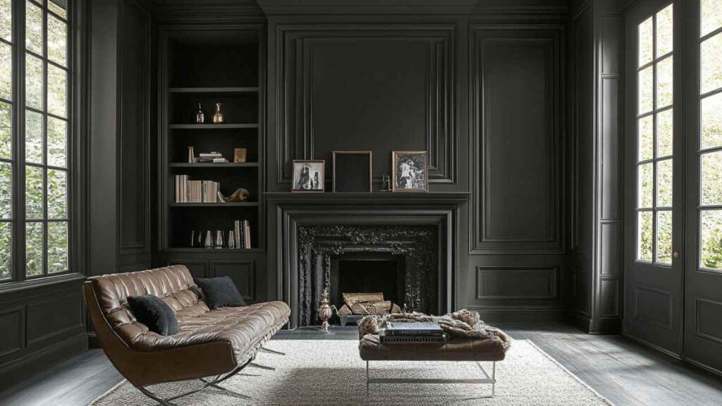
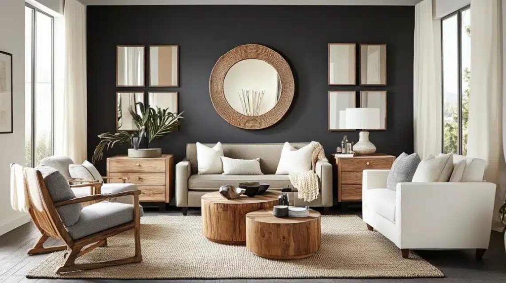
Iron Ore in living rooms: I’d use Iron Ore as an accent wall in a living room rather than all four walls.
Behind a TV, behind a shelving unit, or on a fireplace wall, it can create a high-contrast without dominating the space.
If you want to go with four walls in Iron Ore, make sure you have good lighting and at least one large window.
Some people love the cocooning feeling.
Pair it with light-colored furniture and bright white trim to keep some visual breathing room.
Bedroom
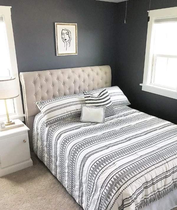
Peppercorn in bedrooms: It is perfect for bedrooms.
It creates a sophisticated, calming envelope that works whether you’re going for modern or transitional style.
The soft nature of Peppercorn compared to Iron Ore means your bedroom feels restful.
I’ve used it on accent walls behind beds and full four-wall, both work great.
The warm undertones which can emerge in lighting help bedrooms feel cozy rather than cold.
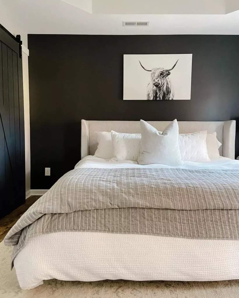
Iron Ore in bedrooms: This is risky but can be STUNNING.
Iron Ore creates a dramatic, moody bedroom that feels like a retreat.
But it needs to be intentional. You need good lighting, and you need to balance it with light elements.
All-Iron-Ore walls with dark furniture and dim lighting are dark.
But Iron Ore walls with white ceiling, white trim, light wood floors, and bright bedding is a high-contrast modern look.
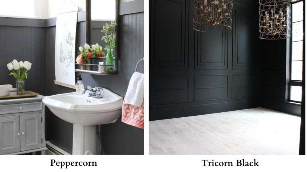
Bathroom
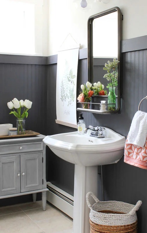
Peppercorn in bathrooms: Works well in medium to large bathrooms.
The neutral nature with the subtle brown undertones can make bathrooms feel spa-like and elevated.
Looks nice in bathrooms with natural stone or marble because Peppercorn complements the materials.
It’s dark to hide imperfections but not so dark that your bathroom feels like a cave.
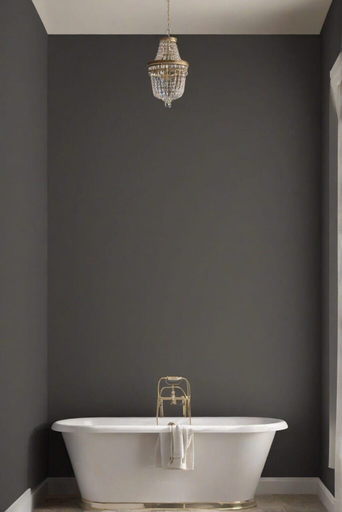
Iron Ore in bathrooms: This is either going to be your favorite design choice or a mistake you regret.
Iron Ore in bathrooms creates drama.
It’s gorgeous with white tile, brass or gold fixtures, and good lighting.
But bathrooms have limited natural light. If yours has a small window or no window, Iron Ore makes the space feel claustrophobic.
I’ve done Iron Ore in powder rooms with excellent results.
Kitchen
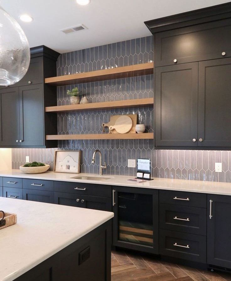
Peppercorn in kitchens: Love this for kitchen islands.
Peppercorn creates a grounded, sophisticated vibe against white or light-colored perimeter cabinets without the harsh contrast of Iron Ore.
It’s also great for lower cabinets if you’re doing a two-tone kitchen.
The warm undertones that can show work nicely with wood floors and warm metals like brass or copper.
Iron Ore in kitchens: Iron Ore kitchen islands against white uppers and white countertops create a high-contrast look. It’s dramatic and modern and makes a statement.
But be aware that fingerprints and dust can show on dark cabinets.
The near-black quality of Iron Ore means you’re committing to the bold look.
It’s not subtle. But if that’s what you want, Iron Ore delivers.
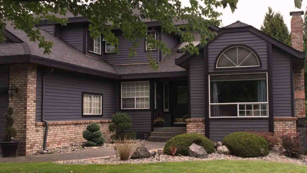
Exterior
Peppercorn on exteriors: This creates an elevated, sophisticated exterior that’s dark without being harsh.
Peppercorn on siding with white trim is a classic modern farmhouse look.
It photographs beautifully.
The chameleon quality works in your favor as it’ll look different in morning vs afternoon vs evening light, which keeps the facade interesting.
Works gorgeously with natural wood accents and black metal elements.
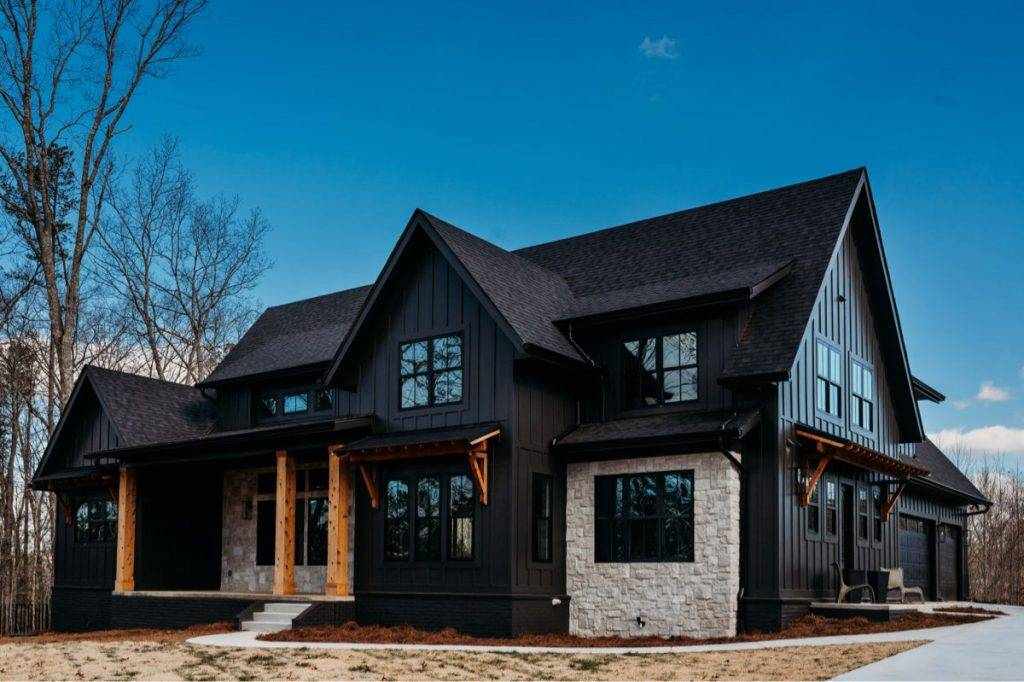
Iron Ore on exteriors: This is a statement exterior.
Iron Ore siding makes your house stand out on the street.
It’s popular for modern exteriors and contemporary farmhouse styles.
The near-black quality creates a visual appeal and drama. In hot climates, this matters for cooling and potential paint fading.
The cool blue undertones can be striking on exteriors in natural light.
Peppercorn Vs Iron Ore Vs Other Colors
Because of course these aren’t the only dark colors in the game.
Let’s look at how they look against other popular options.
Peppercorn Vs Iron Ore Vs Tricorn Black
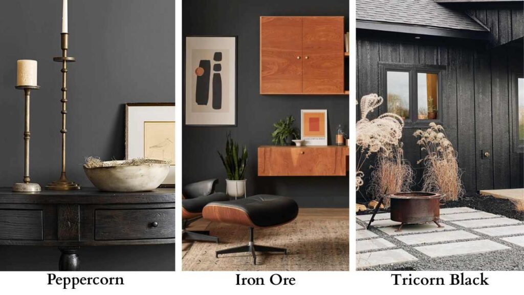
Tricorn Black (SW 6258) is Sherwin Williams’ true black paint.
Not almost-black, not charcoal but true black.
When you line up all three, the progression is clear:
Peppercorn (lightest, LRV 10), Iron Ore (darker, LRV 6-7), Tricorn Black (darkest, LRV ~3).
Tricorn Black is what you choose when you want black.
No undertones, no reading as charcoal in some light.
It’s perfect for interior doors if you want maximum contrast, for window trim, for the dark look.
Iron Ore is in this spot where it’s almost as dark as Tricorn Black but has the blue-green undertones that give it character.
Peppercorn is lighter and is gray, not black.
Peppercorn Vs Urbane Bronze
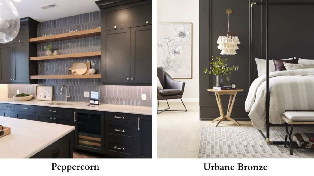
Urbane Bronze (SW 7048) was Sherwin Williams’ 2021 Color of the Year.
It’s a dark brown with warm undertones, a different vibe from Peppercorn’s gray base.
Urbane Bronze is warm, browner, and can look similar to Iron Ore in some lighting.
But next to Peppercorn, Urbane Bronze is brown-based while Peppercorn is gray-based.
If you like the depth of Peppercorn but want something warmer and organic, Urbane Bronze is good for considering.
Peppercorn Vs Tricorn Black
This comparison comes up for interior doors. Both work beautifully for the dark door trend.
Peppercorn doors look dark charcoal, sophisticated and modern but gray.
Tricorn Black doors is BLACK black with maximum contrast and drama.
If you have white walls, Tricorn Black creates a sharp, striking contrast.
Peppercorn creates a soft, subtle version of the same look.
I prefer Peppercorn for doors in many situations because that a bit of gray keeps it from being stark.
Tricorn Black Vs Iron Ore
Iron Ore is the safe choice because it’s softer than true black with the drama.
The blue-green undertones give it a personality that black doesn’t have.
Tricorn Black is the choice when you want zero ambiguity.
On interior doors, I see Iron Ore used more often because of the character.
On exterior trim or shutters, both work equally well but it depends if you want pure black (Tricorn) or near-black with undertones (Iron Ore).
Iron Ore Vs Urbane Bronze
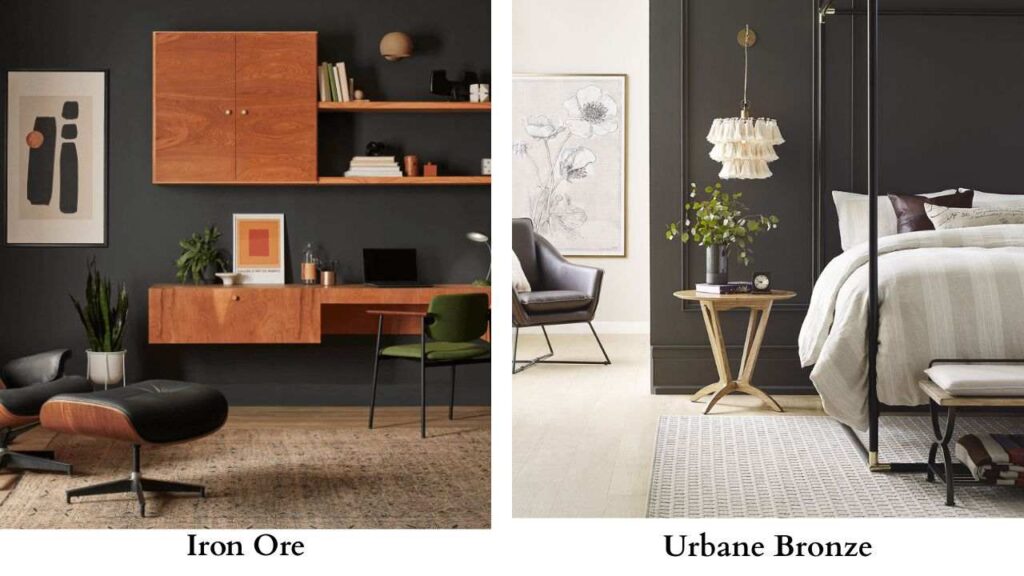
These two can look surprisingly similar in certain lighting, which confuses people constantly.
Urbane Bronze is warm, it’s a dark brown.
Iron Ore is cool, charcoal gray with blue tones. But in low light or in photos, they can look similar.
The difference becomes obvious in good natural light.
Urbane Bronze shows the warm bronze-brown quality.
For exteriors, both are popular. Urbane Bronze is having a moment for exterior trim and shutters.
Iron Ore dominates for full siding applications where near-black is the goal.
| Color | LRV | Base | Undertones | Best Use |
| Peppercorn | 10 | Gray | Neutral/chameleon (brown, taupe, can shift blue or green) | Full walls, versatile |
| Iron Ore | 6-7 | Dark gray/charcoal | Cool (blue, green) | Accent walls, doors, exteriors |
| Tricorn Black | ~3 | True black | Minimal | Maximum contrast, doors, trim |
| Urbane Bronze | 11 | Dark brown | Warm bronze | Trim, doors, warm exteriors |
Conclusion
Choose Peppercorn if you want sophisticated depth without the intensity of near-black.
If you’re painting full rooms, if you want something versatile which works in multiple lighting situations, if you want dark gray that feels approachable.
It’s the safe choice in the best way possible because it delivers drama without overwhelming the space.
Choose Iron Ore if you want DRAMA.
If you’re ready for near-black and you love high-contrast looks.
If you’re doing accent walls, interior doors, exteriors where you want to make a statement.
If you have good lighting and are not scared of bold choices.
You can’t go wrong with either one.
They’re both gorgeous, sophisticated, modern colors that have staying power.
But get samples, paint them on boards, move them around your room in different lighting throughout the day to know which will suit your space the best because choosing between Peppercorn Vs Iron Ore can be a bit confusing.
FAQs on Peppercorn Vs Iron Ore
The main difference is darkness and undertones. Iron Ore (LRV 6-7) is darker than Peppercorn (LRV 10) and can be near-black charcoal with cool blue-green undertones. Peppercorn is a true deep gray with neutral, chameleon-like undertones that can shift between warm brown, taupe, blue, or green depending on lighting and surrounding colors.
Yes, but they’re dark colors, so using them together requires intentional design. You can use Iron Ore on interior doors with Peppercorn walls, or Iron Ore on a fireplace surrounded by Peppercorn in the rest of the room. The contrast between them is subtle since both are dark.
Both coordinate beautifully with pure whites, warm wood tones, and natural materials like stone and marble. For Peppercorn, warm whites, beiges, and greige colors work well because it can show warm undertones. Also looks great with brass and mixed metals. For Iron Ore, go with cool whites, black and chrome fixtures, and light neutral walls.
Iron Ore is darker. Iron Ore has an LRV of 6-7 while Peppercorn has an LRV of 10. The 3 to 4 point difference is visible and meaningful. Iron Ore is near-black in lighting conditions, while Peppercorn maintains its identity as a deep charcoal gray.