Wythe Blue (HC-143) and Palladian Blue (HC-144) are both in Benjamin Moore’s Historic Collection.
These soft blue-green paint colors have a spa-like quality which everyone loves, but here’s the thing about wythe blue vs palladian blue that they’re close enough to make you second-guess but different to change your room if you pick wrong.
Both colors are described as airy and calming, which is accurate but not helpful when you have to choose.
I’ve watched homeowners stare at the paint swatches for too long.
Designers and renovators are in the line too.
The problem is that getting the undertone wrong isn’t just annoying, it can make your whole space feel off.
So, I’m breaking down how Wythe Blue Vs Palladian Blue looks in rooms with lighting.
We’ll look at the color profiles, compare them side-by-side that matters (LRV, undertones, how they react to your lighting situation), and go room-by-room so you know what you’re getting into.
Here are my other blog posts that you can also read:
- Liveable Green Vs Softened Green
- Wrought Iron Vs Iron Ore Paint
- White Dove Vs Alabaster
- Manchester Tan Vs Accessible Beige
- Eider White Vs Alabaster
Color Profile of Wythe Blue Benjamin Moore HC-143
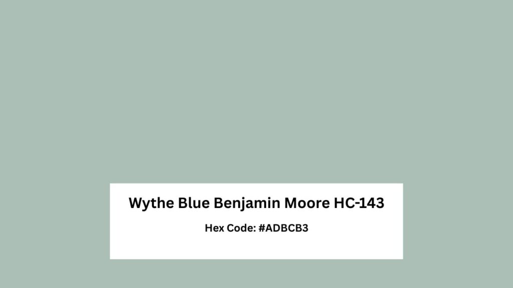
Wythe Blue is sometimes more blue or more green and the green side is most considered.
With an LRV of around 48-49, it is in the medium-light range that’s deep to have presence but not dark that it swallows your whole.
The gray undertone is doing a lot here, keeping things from going tropical.
Without the gray softening, Wythe Blue would be too intense for spaces.
But because of it, you get a muted, earthy quality that makes it feel grounded.
Here’s what I’ve learned after using Wythe Blue: it is cool and deeper than Palladian Blue.
In rooms with warm light or southern exposure, the green undertone comes out to play.
Sometimes it is aqua, sometimes it is minty, and if you have natural wood with warm tones, it pulls green.
Modern, transitional, and contemporary spaces love Wythe Blue because it has personality without looking for attention.
It works well on exteriors too. For interiors, living rooms get that calm but collected vibe, bathrooms turn into spas, and bedrooms become peaceful retreats.
The saturation level is stronger than Palladian Blue.
It’s soft, but it has more color in it.
Color Profile of Palladian Blue Benjamin Moore HC-144
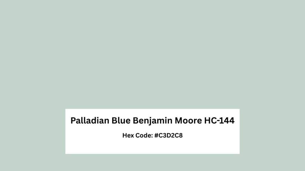
Palladian Blue is the chill color. At an LRV of 60-61, it’s light and reflects light more than Wythe Blue, which makes it more versatile for spaces that don’t get natural light.
The undertone here is interesting because while it’s blue-green, the gray base is strong and it is more blue.
Sometimes it looks light blue, blue-gray, you’ll catch a hint of green but it’s subtle.
People call Palladian Blue a “chameleon color”.
What they mean is that it adapts to different lighting without doing a personality change.
In north-facing rooms it stays cool and airy without going sad and dingy.
South-facing rooms, it looks clean and balanced.
For living rooms and open-concept spaces, this color is made for it.
It’s soft to feel neutral but has color to feel intentional.
Bedrooms get a serene vibe without feeling cold.
Kitchens feel fresh and clean. It’s the safest bet between these two. The spa-like quality is real with this one.
Wythe Blue Vs Palladian Blue: Side-By-Side Comparison
Okay, let’s get into the specifics because this is where you understand about these colors.
LRV (Light Reflectance Value)
Wythe Blue is at LRV 48-49 while Palladian Blue is at 60-61. That 12-point difference matters more.
Palladian Blue reflects more light, making it better suited for average rooms with low lighting situations.
If your room has small windows or faces north and doesn’t get blasted with sun all day, Palladian Blue keeps things feeling bright and open.
Wythe Blue’s lower LRV means it absorbs more light. In a room with natural light, southern exposure, this is great because it prevents the washed-out look.
But go with Wythe Blue in a dark room and it’s going to be deep and feel heavy.
For front doors, both work but Wythe Blue is traditional.
For kitchen cabinets, either works depending on your light situation.
For whole walls in main living spaces, Palladian Blue is the best choice.
Undertones
This is where people get confused because both are blue-green but the balance is different.
Wythe Blue has a strong green presence with gray softening it.
The green comes out strong with warm light, wood tones, or in rooms with golden afternoon sun.
The gray undertone keeps it from full mint but it’s greener than Palladian Blue.
Palladian Blue is more blue with gray. The green is there but it’s playing backup.
This makes it feel neutral and easier to work with when you’re trying to coordinate with other rooms or existing finishes.
Lighting Behavior
Lighting is EVERYTHING with these colors and with any blue-green. Wythe Blue is reactive.
North-facing rooms make it look cool and gray.
South-facing rooms warm it up and bring the aqua-minty side.
East-facing gets you soft and fresh in the morning but it loses steam in the day. West-facing rooms with the afternoon light look green.
Palladian Blue is more stable and predictable. It maintains its soft blue-gray quality across different lighting situations.
North light keeps it cool but pleasant.
South light brings out the best in it without changing its personality. East and west exposures don’t throw it off.
Styling and Best Uses
Trim color matters. Both colors work better with warm whites rather than bright cool whites.
I use White Dove with Palladian Blue and it’s a perfect soft contrast.
With Wythe Blue, Oxford White or White Dove work on how much contrast you want.
For ceiling paint, don’t go cool or you’ll create weird contrast.
Also avoid creamy yellows because they’ll make the green undertones go wild.
Furniture and accent pairing: Wythe Blue looks gorgeous with light natural woods, marble, and chrome or nickel fixtures.
It’s a coastal-modern vibe. Palladian Blue is flexible and works with everything from warm wood tones to white cabinetry to stainless steel.
Greige and beige neutrals pair well with Palladian, while Wythe Blue needs cool supporting colors.
| Comparison Factor | Wythe Blue HC-143 | Palladian Blue HC-144 |
| LRV | 48-49 (medium-light) | 60-61 (light) |
| Dominant Undertone | Green with gray | Blue with gray |
| Saturation | More colorful, strong presence | Soft, muted |
| Lighting Stability | Reactive, shifts noticeably | Stable, predictable |
| Best For | Accent rooms, high-light spaces, doors/cabinets | Whole-home color, open-concept, versatile |
| Style Match | Coastal, modern, contemporary | Traditional, farmhouse, transitional, coastal |
| Pairs Best With | Cool whites, light wood, chrome | Warm whites, greige, various neutrals |
Wythe Blue Vs Palladian Blue: Room-By-Room Comparison
Let’s get specific about how these colors look in different rooms because theory is nice but real-life application is what matters.
Living Room
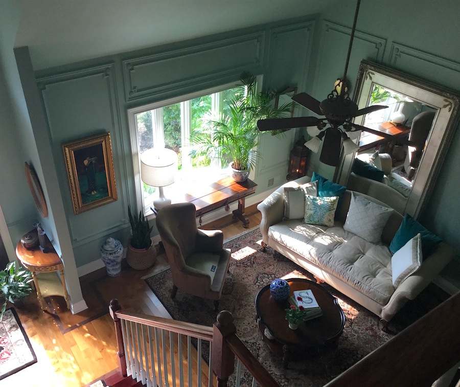
Wythe Blue in a living room works best when you have good natural light and want the color to show up. It creates a defined, intentional look.
If your living room has southern or western exposure, the green undertone adds warmth without going tropical.
Pair it with white trim, keep furniture neutral, and add green plants to get blue-green harmony.
I used it in a transitional living room with large windows and it was perfect to create an atmosphere without overwhelming the space.
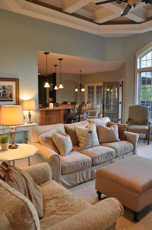
Palladian Blue in a living room is your safe bet, in open-concept homes where the living room flows into other spaces.
It is a soft, neutral that makes the room feel large and open.
Works beautifully with both cool and warm accent colors.
I’ve styled it with everything from navy accents to warm cognac leather and it adapts to both.
Bedroom
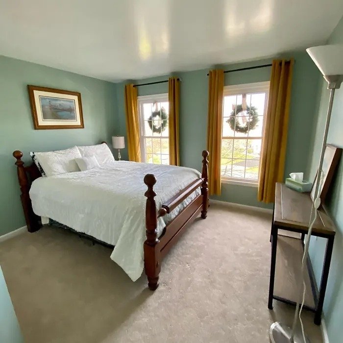
Wythe Blue creates a colorful, spa-inspired bedroom. If you want your bedroom to feel like a coastal retreat, then go with it. The strong saturation creates a cocoon effect that feels restful.
It works well in bedrooms and gets morning light which is soft, fresh quality.
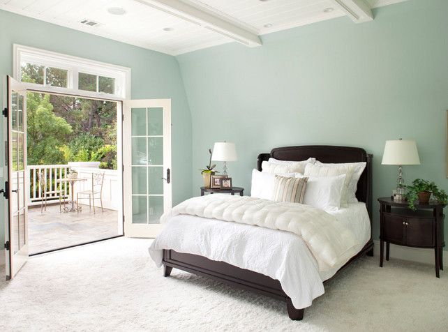
Palladian Blue is the better choice for a serene, subtle bedroom.
It fades into the background in the best way, creating calm without demanding attention.
If your bedroom is on the small side or doesn’t get natural light, Palladian Blue keeps it feeling open and airy.
I painted my guest bedroom this color because it works for different people with different color preferences.
Bathroom
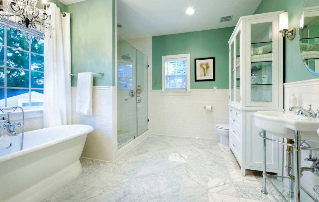
Both colors are made for bathrooms, but the vibe is different.
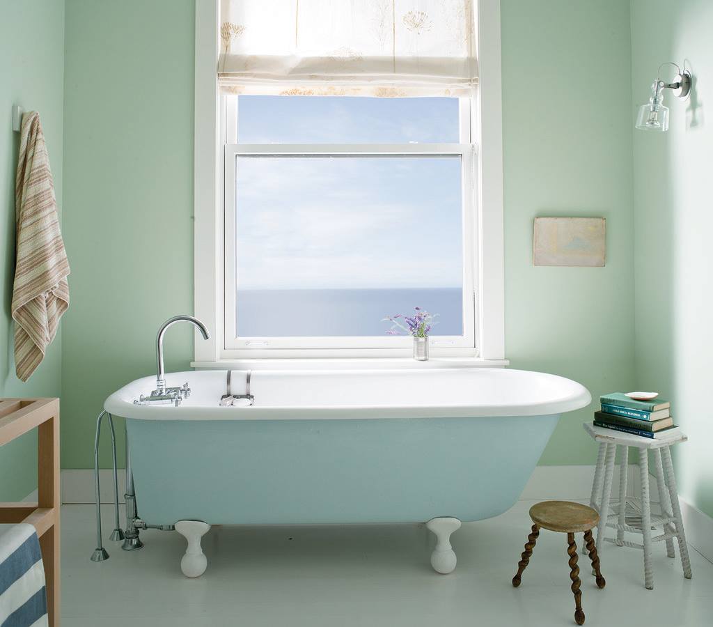
Wythe Blue turns your bathroom into a spa.
Throw in white subway tile, marble countertops, chrome fixtures, and good lighting.
The strong color saturation feels luxurious and intentional. I used it in a powder room with a large window and it was stunning.
But here’s the thing about Wythe Blue in bathrooms: it needs proper lighting.
If you have a windowless bathroom with artificial light, warm-toned bulbs, it can go too green and feel weird.
Palladian Blue creates a soft, clean, fresh bathroom vibe.
It’s spa-like but in a quieter way. Works perfectly in primary bathrooms, guest bathrooms, doesn’t matter.
The light LRV is great for bathrooms that don’t have windows because it keeps things bright.
It also stays neutral that your towel and decor choices aren’t limited.
Kitchen
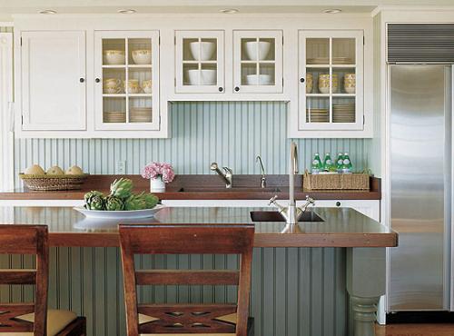
Wythe Blue for kitchen cabinets is a bold but beautiful choice.
It’s got color to create visual interest without being overwhelming.
Works best on lower cabinets with white uppers, or on a kitchen island for contrast.
In a kitchen with great natural light and white or light countertops, it creates a fresh, modern look.
I wouldn’t use Wythe Blue on all the walls in a kitchen.
If you want it on walls, use it on one accent wall or in a kitchen that gets southern light where it stays balanced.
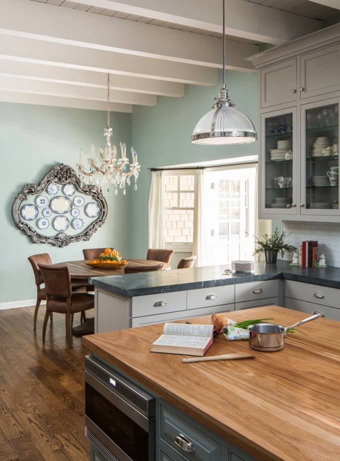
Palladian Blue is versatile in kitchens. On walls, it creates a soft, clean backdrop that works with white cabinetry, wood tones, stainless steel, and on everything.
On cabinets, it’s subtle and sophisticated without being boring.
The light LRV keeps the space feeling open, which is important in kitchens.
Exterior
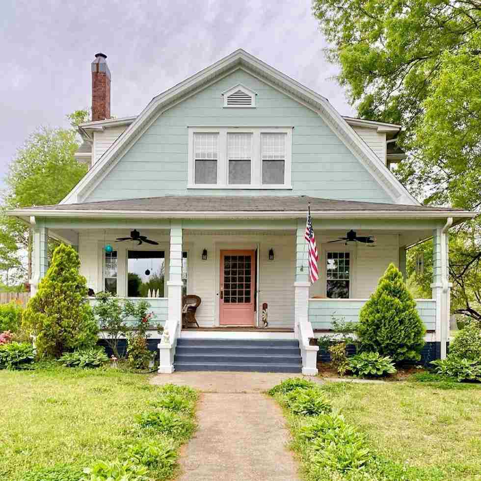
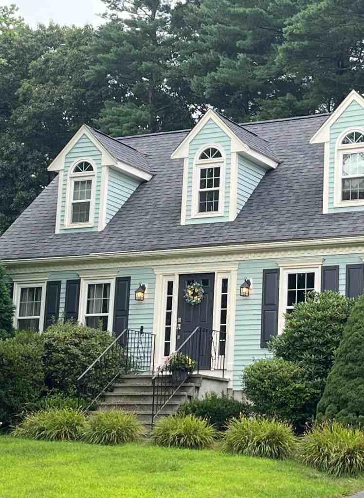
Wythe Blue on exterior siding creates a beautiful coastal modern look, but be aware that direct sunlight will wash it out.
It works better on covered front porches or as a front door color where it gets some protection from the elements.
I’ve seen Wythe Blue front doors with gray siding and white trim and it’s gorgeous.
If you’re doing exterior siding, make sure you see it in direct sunlight before committing because that LRV of 48 can look pretty washed out in full sun depending on your home’s orientation.
Palladian Blue works beautifully as a front door color because it’s classic, elegant, fresh.
For full siding, it creates a soft, sophisticated exterior that isn’t boring but isn’t loud.
The high LRV means it reflects light so it doesn’t absorb heat, which is nice in warm climates.
Pairs well with white trim, works with both warm and cool accent colors.
What is the difference between Woodlawn Blue and Palladian Blue?
Woodlawn Blue is NOT the same as Palladian Blue, even though people confuse them.
Palladian Blue is described as more colorful and richer than Woodlawn Blue.
Woodlawn Blue is soft and is more gray-blue with less green presence.
If you want something more muted than Palladian Blue, consider Woodlawn.
But if you want that blue-green spa feel, Palladian Blue is the best.
Wythe Blue Coordinating Colors
Bright whites are your best friend with Wythe Blue.
I always use White Dove or Chantilly Lace for trim.
The soft warm quality of White Dove is nice because it doesn’t create harsh contrast but defines the space.
For adjacent rooms or coordinating spaces, soft grays without purple undertones work well.
Avoid anything cool or you’ll end up with competing undertones that feel disjointed.
Natural wood tones, mainly light woods like oak or maple, play well with Wythe Blue’s blue-green quality.
Dark woods can work but they create contrast, which may or may not be what you want.
If you’re doing accent colors or decor, whites, soft grays, natural linen, and some warm terracotta tones can work.
The terracotta creates an interesting contrast that plays off the green undertone.
For a bold look, navy blues like Hale Navy create depth and drama while staying in the same color family.
You could do Wythe Blue on walls and Hale Navy on built-ins or an accent piece.
If you want to bring out the green side, soft sage greens or muted olive tones harmonize well.
But be careful not to make it too green or it loses its blue-green balance.
Conclusion
Look, choosing between Wythe Blue vs Palladian Blue comes to your space and what you’re trying to achieve.
Wythe Blue gives you more color, more personality, and works beautifully in rooms with light where you want that spa-like coastal vibe to show up.
Palladian Blue is versatile, goes-anywhere, works-with-everything option which creates calm sophistication.
If you’re unsure, get samples of both and test them in your space.
Not only holding up a paint swatch but using paint boards or using peel-and-stick samples and watching them throughout the day as the light changes makes it easy to consider.
Wythe Blue Vs Palladian Blue, both are beautiful colors.
You’re not going to ruin your space, you’re creating a different mood because choosing the best color for your space is necessary and contrasting it with other colors makes it more liveable and airy.